 Here is the new CD art for Hal & Al's upcoming Miracle League Benefit Concert CD. These will be given away to everyone who shows up a token gift who bought a ticket. I also had to come up with a two color piece of art to do on the CD itself so I thought a baseball design would tie it together nicely.
As with any new project, each one usually has it's pitfalls or trouble spots that need fixing. I'm posting these last three pics just to show off my Photoshop skills since no one will ever really know the real work that goes into it from looking at the finished product since it will be printed at CD size. If I don't toot my own horn, no one will for me.
*
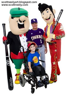
Here is the original photo I got from the professional photoshoot taken down in Louisiana. You can click on it for a bigger version!
The first thing I had to do was separate the background from the characters (as I called them) and once that was done, check all the edges to be sure it was a clean sharp separation. If not I digitally paint the areas that need it. I then fixed Al's turkey neck problem and I also fix little flaws on Al's hands to make them look nice and not so much like a glove. I next take off Hal's eye screen off of his chin.
*
Next is the big job of adding a flesh color to Hal & Al. Every professional shoot always whites them out and they look like Casper the Friendly Ghost. For some reason flesh tones on these kinds of costumes never look right after they've been photographed; it most likely has to do with the lighting necessary to get the shot in general. If you shoot in bright sunlight for outdoor events, they get whited out as well. So in order for the characters to print correctly I have to add a flesh tone color over top on a new layer. By doing it that way on a new layer, I can then pull the opacity and then pick the setting that gives me the tone I want.
*
Next up, Scott Innes wanted to add Rhinestone Al's scarf in it since it wasn't visable in the original shot and it was tucked inside Al's coat. You can see part of it hanging down past his belt in the original shot. So I took scarfs off of other Al photos, which were all yellow, and then had to change them to purple to match the new scarf since it goes with his yellow shirt. Once I added the new scarf into place I then had to fix it so it looked like it was there originally, so that took some time and then I painted in the shadows to ground it more. Boy, it came out looking great! "Is it real or is it Memorex?"
*
Then I had to paint over the part of the pants and digitally take out the purple scarf that hung down. Once that was all taken out, I then created a new belt loop and then worked my way down and digitally painted in the folds of the pants to match the original the best I could. This part took the longest though the whole thing took about 3.5 hours total. I had to work on the original large high res photo since I didn't know if a larger version of the photo would be needed for other advertising at some point. If I did all this work on a small version, I would have been screwed. It's happen before where I did the work in Photoshop and the place we dealt with needed vector art.
*
So Rule #1: Always work big if you can! and Rule #2: Ask what they will be using the stuff for and get exact sizes! If they aren't sure, just work big!
 Then came the newest change after 99% of the CD had been done. Scott told me to go back to the original photo again and take the WYNK Radio logo off of the kid's t-shirt. There might have been a conflict with LSU coach Paul Mainieri being on the cover and a radio station affiliation. It was probably nothing and even with it being so small on the actual CD cover, we didn't think anyone would see it anyway. But to prevent any problems that might or might not come, I painted over the logo with blue and then went back into it to fix the folds and such to make it look like a natural blue t-shirt. Then I added the vector art of our first Hal & Al concert tour logo on top of the shirt and tweaked it so that it really looks like it was sitting on the shirt. As I tell young art students, a great knowledge of perspective goes a long way and also works in other areas of art! So you must learn it well!
*
After it was done, I then took it and dropped it onto the front cover and resized it to fit with everything else. Normally when I do photos of Hal & Al where the characters are the real versions of them in their costumes and not their cartoon forms, I like to add a digital illustration to the background to jazz it up and give it that kid's show look. Works very much like a green screen. The shadows I painted under the characters ground them really well and make them look like they are standing on the field. I also then have to lighten the whole CD art a tad since it always prints darker on the actual CD packaging, which is why I always get the color proofs sent to me to sign off on from Oasis Manufacturing. Always see the proofs if you can!
*
Here is the FINAL version! Click on the big version to see how it turned out!


No comments:
Post a Comment