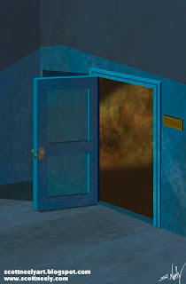
Here's two angles of a door to a storage closet. Once again the characters covered most of them so it's kind of nice to see them unfettered by other elements. Both took about a little over an hour and a half each and most of that was figuring out a color theory that worked for it since it was nightime and an interior that basically had no lighting. I also changed the inside of the closet's main lighting to reflect a story element hence why one is green and the other is a tannish brown. I also kept it clean and crisp as opposed to the underground scenes which are murky, misty and spooky which I kept a little looser. I love the slight bird's eye view of the bottom door though.
Sunday, February 20, 2011
Saturday, February 19, 2011
Another Background - Exterior Shot
As with all my backgrounds they usually start in Illustrator and are drawn with the pen tool. Once it's all built to a certain degree and I have everything that I will need, I send it to Photoshop where I then paint the rest using my build layers as a guide and to help me select certain areas. The hard part is matching the look of the show, so I had to create a bunch of brushes that would give me different effects to get it as close as I could. The show had a sponge brush effect all over it and it was hard since each sponge effect had a different texture to it. I now have a certain way to paint and a workflow where I can create this kind of shot from start to finish in about 2-3 hours or so. Also, I painted this originally in day time colors and saved it that way as well. If I take a few overlays off of this piece it would be a daytime scene and hence could be used again! There also isn't a lot of overall detail to the store front as character art mostly covered the lower part of the piece. As with all backgrounds, they're just meant to ground and give placement to your characters, since in the end it's all about the characters!
Thursday, February 17, 2011
Creepy Caves...
Here's some more of my creepy cave backgrounds. The top one was wider in the final version and I had to paint more to it to extend it but this was the original paint job which I kept. I keep it all. What's a little less hard drive space...
For the bottom one, each of the foreground rocks on the bottom one were on separate layers so I can make them visable or not, or even move them around if I want, by clicking on their layers. I made it a full painting without the rocks just in case I needed another generic cave setting. I also added the green night fog on it's own layer as well in case I didn't want it. That's the beauty to have all these layers for each painting. I can change things easily without much muss or fuss. This background took the worst hit as for all that work that no one will ever see. Maybe 10% of it was left to see once all the characters were added, but like I said, I can change the color of the cave to blue or something and it could be the Batcave!
Wednesday, February 16, 2011
How To Get The Most Out Of Your Backgrounds...
Thought I'd post some background paints I did and how I try to plan in the initial sketches of a background to create it in layers so that by clicking off some layers I have a different background that I can use for something else at some other point in time. I try, if I can, to design it and work it so that I can get multiple uses out of it be it a week later of three years later. It's kind of like being a set decorator on a TV show and having to make do with a small budget. With a couple simple changes you can save a lot of time and money. I bring this up as I've been watching the first season of Starsky & Hutch this past week at night and if you watch 3-4 a night as opposed to once a week, you can notice the set redresses and some of the same background props like a painting pop up in different scenes a lot more. All shows and movies do it to save money. Most Star Trek fans never noticed that the bridge of the Enterprise in Star Trek II (Khan!) was redressed and relit to become the Reliant! It was so well done that even hardcore Trek fans never noticed. The only reason I know it is because Shatner mentioned it in his book Star Trek Movie Memories. It's an interesting study and to see how with just a few simple changes, a set becomes completely different. Hanna-Barbera would do the same thing as well in their cartoons and create a long panaramic background and use it for many scenes to save money animating. They would do all their planning in the storyboarding stage so they could figure out how mnay backgrounds they would actually have to commission to be done.
Below is a big painting of mine that is around 11 x 17 in full size when I did it and was the original base painting that could be used for something for sure... BUT it had to be tweaked a lot for what I actually needed it for so I then saved a copy of the file as it was and then resaved it with a new file name and repainted it part of it. Character art will kill a lot of the work actually so no one will ever see the full background hence why I'll be posting some of them here. Some of these were really a lot of work and there's a lot of detail that got lost in the final image from being covered up. But they did what they need to do and that was to create a sense of tone and mystery to the story.
And above is the final after I did some 'digging' and made a hole that was used as an entrance and as an escape. I can also take out the blue room above and put whatever else I would want there as well. Possibly the hole leads to a desert landscape... or a spaceship! Just so long as it's in persepective to the rest of it, I can redress it anyway I want. The object is to keep it all separated in layers so that changes can be slipped in and out. It can also be changed color wise as well if I wanted it by moving the levels in Photoshop to lighten or darken it, or the saturation/hue to change the overall color tone! It was also cropped a bit as well to suit what I needed it for but as I mentioned, I have the original file to go back to if I needed it. One painting = Two uses... or More!
Monday, February 14, 2011
MYSTERY INCORPORATED - Another Teaser!
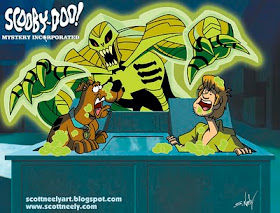 Here's a pic of the print that I gave out for a Christmas Gift to a lucky few this past holiday (you know who you are) sans the show logo and my blog tags. It was about 11 x 15 with a white border around it and it looked super sweet on gloss paper. Very happy with the painted backgrounds and color work I did on my Mystery Incorporated work, and since I was busy working on it and didn't have time to shop, I decided a week before Christmas to get some quick prints made and I just signed and handed them out as a gift. I thought I'd post it here for everyone else to see! Hope you enjoy!
Saturday, February 12, 2011
The Best $130 I Ever Spent...
 I normally don't recommend stuff on my blog but I feel compelled to for this great item. I bought a TomTom XXL 540TM 5-Inch Widescreen Portable GPS Navigator (Lifetime Traffic & Maps Edition) on Black Friday weekend after this past Thanksgiving and I have to say that this was the best money I've spent in a looooonnnnnnnng time. I got it at Staples (on their Black Friday sale which I saw in the sunday paper) and it only cost me $130 on sale. They retail it for $250 at most places, though you can find it cheaper online, but $130 was the best price around here at the time and it's one of the most popular TomTom GPS devices bought today.
 It's incredibly easy to use and I had it up and working rather fast right out of the box. I downloaded the software and plugged it into my computer so I could download the current set of maps that it has and this TomTom version has FREE lifetime support for new maps, which is great since the roads in this country can change up to 40% per year. It's been a big help to me driving to different events recently and has made my life easier and less stressful as I used to hold printed out directions from MapQuest, which were sometimes faulty. The problem was constantly looking down and reading the directions, which was especially tricky at night when it's hard to see in the dark. I have mine stuck on the windshield next to the rearview mirror so it's pretty much in front of me but doesn't obstruct my view of traffic. I shall sing the high praises for this new gadget in my life! I've used it at night while driving back from some places and it's fantastic with it's night vision look. Just follow the red arrow. Greatest invention since the iPod in my mind! This is the TomTom product that I would recommend to anyone if they want to get to where they are going to in a fast and safer manner.
 *
The only other thing I could say is that after you take it out of the box and want to start using it, try driving around town locally using it and see how it works and how it directs you on the roads that you know. Program some favorite places that you go to and then go driving. Deviate from its planned path several times and see how it replans and corrects itself so you get to see how works first hand. It's really quite amazing to see. I say this as you don't want to open up the box and plug it in and drive to Florida without knowing how it works. It is pretty easy to use but you have to learn what little icons are when they pop up for gas stations, phones, etc. I give it 5 stars out of 5!
Friday, February 11, 2011
MYSTERY INCORPORATED Teaser!
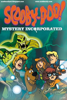 Here is a teaser piece for some of my Mystery Incorporated work I finished up and will be out this summer or late summer I think. Enjoy! For the process junkies, this was drawn on paper and then scanned and then inked in layers in Illustrator and then all painted in Photoshop. Backgrounds were painted in Photoshop too. Everything is layered and I think it's about 37-40 layers total for this file. Took about two days from initial concept to finish.
My Scooby-Doo Drawing Video Is Now Up On YouTube!
Here is one of my drawing videos that I just loaded up to YouTube. I've been running it at my speaking engagements of late and so here it is for the rest of you out there in Internet Land. It's speeded up and cut to Scooby music which was all done by John Tatarelli for me. You can check out the real time, higher quality videos of it on my vimeo page (click here). They don't have any real soundtrack to the real time ones though so you can play your own music to it. This was just a teaser to get some advertising for myself.
Here is a direct link to the YouTube as well! Click Here
My Appearance At The ALFRED G. WATERS MIDDLE SCHOOL Tonight For Their "Real Men Read" Event!
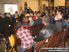 It seems I'm on tour this week with speaking engagements but this is the last one for a little while. Tonight I was at the Alfred G. Waters Middle School in Middleton, Delaware for their annual event called "Real Men Read", which is an event to promote reading in general but also for men to get their sons into reading by showing them that it's fun. Apparently, there are a lot of kids who don't like to read on a daily basis unless they are forced to for school or for homework assignments, so any program where families can come and see writers and illustrators and then purchase some new books is a good thing.
I did a shortened version of my usual talk for two workshops which ran about a half-hour each. There was a lady there who was working the event named Patty Brown and she took these pics with my camera. She did a great job so I'm posting a bit more photos than usual. Thanks Patty!
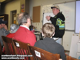 Here's me talking and to a packed house as well. They said they had over 600 people who came last year and I was busy so I don't know how many attended this year. There was great traffic coming and going. UPDATE: Was told today that there were around 900 attendees this year!
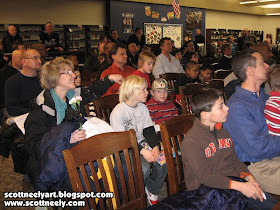
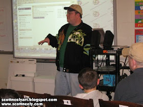
Me being witty... because I am! Wooo!
Me drawing my 30-second Bart Simpson which kids and adults seem to love...
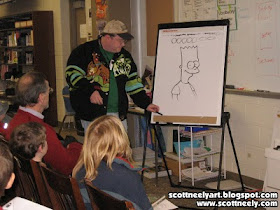 Showed one of the drawing videos I made that was speeded up so they could see how I draw from start to finish.
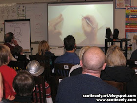
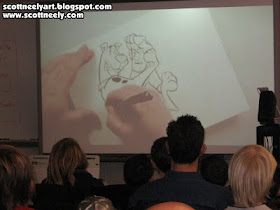
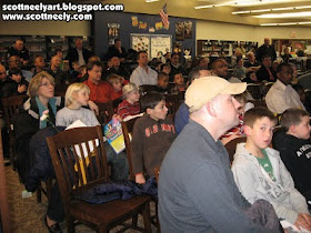 It was a great mix of families and age groups!
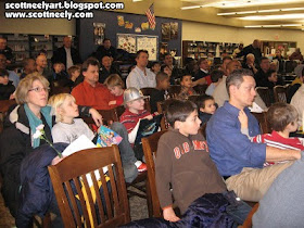
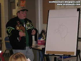 Me talking about construction theory and how characters are built from the ground up...
Wednesday, February 9, 2011
By Popular Demand, My Second Appearance Was Today At ST. EUGENE'S Elementary School!
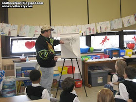 After my appearance last week I was told that the younger students and their teachers were upset that they didn't get me to see me in their classes, so arrangements were made early this week and I went back today and spoke to six classrooms filled with the little ones. I mostly sketched for them and just answered questions and didn't do any slide shows since I was moving between classrooms every 30 minutes and their attention spans are shorter. It was a long morning but they seemed to enjoy it a lot and a little girl in the kindergarden class gave me two thumbs up, which was pretty funny. They all agreed my Scooby jacket was awesome, which of course it is. Each class kept all the sketches I did and I signed one for the class to hang if they wanted to. I'm a hero to the six-year-olds! The harder ones to draw for were the kindergarden class as they really don't know any of the characters (since they were so young) that I do outside of Scooby, Phineas and Ferb, Mickey and Winnie, and a Charlie Brown sketch I did.
My Appearance At ST. EUGENE'S 'Career Day' Last Week!
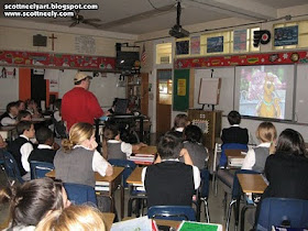 Last week, on February 4th, I was invited to appear for 'Career Day' at St. Eugene's Elementary School in Primos, Pa, which is close to where I live. I spoke to three different classes and talked about what I did with slide shows, my drawing videos, and then did some actual sketching to show them how I draw.

