Tuesday, September 21, 2010

The Evolution Of A Scooby Comic Cover - Final Color Version!

Here's the final color art for the Scooby cover without the logos and UPC. It came out cool! Not sure what issue it's for yet. I thought it was for Issue #2 but it may have been pushed back. I'll update as I find out.

UPDATE - I just found out that this cover will be on Scooby-Doo, Where Are You? #5!

Monday, September 20, 2010

The Evolution Of A Scooby Comic Cover!

I was sent an email from my editor at Wildstorm and he asked me about doing some cover sketches based on a Scooby story I just drew. I love to do covers so I readily jumped on it! Since I've been asked on this blog (and other places) about the process and the steps of what I do and how it happens, I thought this cover would be good for doing a step-by-step of the creative process.

The first thing I do is ask the editor, or art director, if they have any specific thing in their mind that they want to have portrayed or the main focus of a cover. A lot of times they will leave it up to the artist but I've had some who wanted to convey a theme or idea. This cover is based on a story I just drew and not to give anything away but the story was based in a circus setting and a locked door was a big part of the mystery to be solved. The only real dynamic to doing a Scooby cover is to make it fun and a bit spooky, with possibly some humorous overtone to it.

So, in terms of drawing, the first thing I do is work up some thumbnails of ideas, which you see above. My editor said I could write down concept ideas in an email and see if those ideas would work in a verbal pitch and sometimes they do, but for this cover I thought a verbal description wasn't as "readable" as a visual thumbnail. There was a lot going on and a visual guide would be more helpful. For doing my thumbnails, I have a small layout page (8.5" x 11") I made based on the DC Comics grid and there are four of them on a page. The grid is 30% of the original art size but it's all proportional. It has all the bleed and live area marked out and as you can see from my thumbnails there is a mark on the outside of each of the grids (on each side) and this lets me know that the top 1/3 of the cover is where the logos and other company info will go and I can't have any important information go up higher on the cover since it may be covered up. I also plan where the UPC box code will go as well.

I came up with six ideas and drew them that night and the editor had them the next morning. He liked them and submitted them to Warner Bros for approval. They came back four days later and ALL the cover ideas were approved (WOW! That's cool to hear! It doesn't happen all the time!) but WB liked Cover "E" best. So my editor asked me which one I liked best and (as noted on the thumbnails) I liked Cover "C". My editor then said to do "C" but to add some creepy hands reaching out for Shaggy and Fred and to possibly add a spider dropping down on a web to add a spooky or comedic feel to it. I was happy with all of them really so any of them would have been fun to draw.

As an aside, I want to mention that I also wanted the door to be as part of the main focus as well as working with the character (or characters) as the initial focus or "read". A lot of covers are much more effective usually with just one or two characters on it as opposed to a lot of them all vying for the attention of your eye. Rule #1 of a comic cover (or any cover or poster) is that it has to "pop out" on the comic stand from all the others and work at a distance. If you can "read" it from about 5 feet away, and everything is well designed and it catches your eye, it stands out. This is what you strive for when designing a cover. I had that success with the Scooby "Earth Day" cover I did. Also, one of the thumbnails I did is more action-oriented and has the characters running from the circus wagon and the locked door. I try to have some kind of kinetic energy to my covers instead of them just being a static image. Some art directors and editors like a more action-based image to sell something. I do think action-based covers draw a viewer in a lot more than a static one, but it depends on the mood and feel that you are going for. It's hard to do that though when the main mystery is based around a locked door. If there was a monster at the heart of it, there is always a chase involved and you can do that scenario in an unlimited amount of ways visually.

As I said, WB liked "E" which I can see why since it was a focus on Scooby (our hero) and the shadow on the door (K.I.S.S. or Keep It Simple, Stupid). I liked "C" as it had focus on Scooby and the whole gang and encompassed the feel of the story best (in my mind).

Now once I got the final additions from my editor I then roughed out the cover and worked out the details worrying about design, positive/negative space, readability of the shadow on the door and other little details when it gets printed smaller. In an effort to please, and to see if the Cover "E" was also a viable option, I did two roughs. The roughs are done at full comic cover size, which is around 11 x 17 varying the DC art board. I do the roughs at full size just to be sure that the specs are correct and my bleed is accurate. And here are my two roughs:

As you can see on the rough of Cover "C", I left off the Spider on the web since I thought it may be overkill and too much detail to look at and digest. There was enough pulling for your attention as it was. I did have to cheat the angle of the door just a bit to be sure that the shadow cast on the door would work and be readable. This is something that the color will also add to it.

These sketches are inked as well. It's just how I work. I like things to be tight enough and I experiment with the ink to figure out how I will do it on the final version sometimes. It helped to ink these as I was working out how I wanted the wood work shadow lines to run and how thick I wanted the lines to be. I try to nail down as much as I can in the rough stage so that the inking stage is just some spit and polish.

I think Cover "E" works well too. It reads great and the shadow on the door is very readable! I liked the spider but wasn't sure how far to bring it into the picture since Scooby is reacting more to the doorknob twisting than the spider or the looming shadow. Plus you get a great view of the circus. In the 11th hour, lighting strikes me (pun intended) and I thought it would be cool to add a looming storm in the background as well since I added lighting bolts in the background of the story as it progressed. It's another aspect that color will enhance.

Once both these roughs were submitted the next day, it was agreed upon to use Cover "C". The only thing was that the UPC symbol would have covered up part of Scooby and that's kind of something that artists and editors hate. You never try to have anything cover up the main character, let alone the star of the project! The editor asked if he could get more bleed on it so we could move Scooby a bit so the UPC wouldn't hurt the art. So I immediately got the great idea of how to fix it in a minute and rescue the piece from any redrawing! This is why I love Photoshop! I grabbed a portion of the lower inside of the door and the doorknob itself and raised it up with a simple copy and paste. I moved it up and then placed a scanned version of the UPC symbol that I use for my layout grid and then emailed it back to the editor in about 2 minutes! He loved it and told me to then go and finish it! Problem solved! I didn't even have to tweak the eyeballs of the characters as they were all looking that way anyway. Talk about an easy fix!

So I lightboxed and inked the final art onto DC Comic art board and I do this as well instead of digitally inking since I can then sell the artwork after it's done. The main reason why I do all my comic work still by hand is for the sale of the original art. At this stage of the final art I make little tweaks and finalize the art and make sure my line quality is sharp and strong. Fans may not notice any difference between my roughs and final art sometimes but I try to make sure the quality of the final art is as high as I can do it. As you can see I also tweaked the shadow on the door's hand a bit to make it more readable, so that's a noticeable fix. Once this is done and inked, I scan the art at 600dpi and save a copy at full size for my own records and then load the art into a DC Layout Cover Grid and then save it to their settings and emailed it to the editor! If it's small enough I can usually email it instead of loading it up to my folder on their FTP.

Since it was somewhat of a rush, Wildstorm will be coloring it and I'll post it when I get a copy of it! I hope this post was informative to you all! Here's the final art!

Sunday, September 19, 2010

WONDER WOMAN Art For Charity Event!

I was sent an email from Andy Mangels to participate in the Wonder Woman Day V charity benefit for domestic violence programs and apparently this year is a hard sell to get artists to do some art for the event, mostly from any of the main DC Comics Universe (or DCU) artists. Since I felt bad about that I decided to do a piece for it today before I go back to Scooby work tomorrow.

Since I mainly do comic work for the Johnny DC line (what's left of it and now moved to Wildstorm) I decided to do a piece of Wonder Woman from the Justice League Unlimited cartoon series. I thought of doing my version of her but decided to keep it simple for a fan who may buy it. Drawn on 9 x 12 paper and inked with a Pitt Brush Marker and some Microns for the small details on the face and the stars.

You can find out more about the upcoming event at http://www.wonderwomanmuseum.com/

Thursday, September 16, 2010

SCOOBY At The Beach Sketch! - Plus, A Work Update!

Here's a sketch of Scooby at the beach that I did way back in 2000-01 from my records. Probably should have posted it on Labor Day but I was deep into drawing my portrait of Kristy that weekend. Pretty tight pencil work here and all my pencils seem to be this tight on everything. New people I work with are usually shocked at how tight they are compared to other artists they may deal with but doing a lot of licensing has made me this way so it's hard for me to go real loose after 10+ years of etching the final work "in stone" as it were.
*
This past couple days I've been working on a new Scooby-Doo comic cover for Wildstorm. I believe it's for issue #2 where there is a story I drew as well. I will be posting the cover in steps so that you can see the process I go through in creating a cover from concept to finish. I will be doing the final clean up and inks tomorrow for it and then I shall post it as it is and then post a color version when that part is done. People have asked about the working process and I think this cover gives a great idea of how I go about it since there were some artistic choices that I made and some I was asked to draw from the editor. All in all, it's shaping up nicely!

Friday, September 10, 2010

KRISTY McNICHOL Portrait - Or How I Spent My Labor Day Weekend

This past week, when I was working on Scooby, I had a pet project that I was doing in bits and pieces. I worked on it mostly on Labor Day though and finished it the other day after tweaking it for the 15th final time. I've been drawing cartoons for so long that the realistic look that I've used before back when I worked at the Franklin Mint hasn't been used in many years now so I decided to try to get back to using those art muscles... and it was a fight!

I decided to do a portrait. Then I decided to pick a subject that had easier hair to draw as opposed to something more difficult. Always good to start with something easy. I was going to draw Amanda Bynes as she's cute and has the most perfect flowing hair I've seen in a long time, but then I thought if this thing was going to take a long time I'd better pick a subject where the interest won't be waning on it a couple hours in so I thought I better make it something even more personal to my liking if I was in for a long haul. As so, I decided to draw a portrait of Kristy McNichol somewhere around 1978-79 I guess when she was making Little Darlings. I've always liked her and she has the best eyes and smile and I also knew that it would be like drawing a caricature and if you don't get the eyes or mouth just right the likeness falls apart pretty quick.

I had plenty of photo reference for her face but then I picked out a picture of her in a sweater that I thought would work better for the mediums and contrasts that I was going to do the piece in, so in the end I "Frankenstein'ed" the piece in a way, which is what most artists do, and I used the sweater pattern which has dark and light tones to it. The piece overall was done on 11 x 14 paper and was done with pencils of varying hard and soft lead (most of the piece is in pencil), some charcoal on a sponge for the background, a white colored pencil, a black colored pencil, and a white conte crayon in spots. I used a kneaded eraser to help lighten the tones in spots to help with highlights such as the ones on her face. And a normal white art eraser for massive erasing when it got away from me. Also I used some rubbing sticks made of the rolled paper (I can't remember what they're called) to blend some of the gradients together. I added the background as an afterthought as I finished the piece and then thought a contrasting background would push the sweater forward. I wasn't sure how I would do the gradient or how high to take it and so I made a copy of the art and then practiced on how I wanted to the background to look. In real life, you don't have an "undo" button as you do working in the computer so I like working on copies of the art first and then when I'm happy I go and do it on the original art.

I worked on it in bits and pieces mostly and I do have to say that I don't recommend working that way since it's harder to pick when you'll be in the right mood to do the best work. I think it's better to work on it straight through if you can and not have to go back and forth between it and something else. All in all, it took me like 4-5 days of playing with it and working it, erasing, reworking it, and then erasing some more. It was a fight in some areas and I spend a loooooonnnnggggg time on her hair than anything else. Hmm, Her face took a long time too actually. The whole thing took a long time! Most of the work was done last Sunday and Monday on it. It looks great when you stand about 3-5 feet from it, since like a painting, you can see all the sketch lines and such when you're right on top of it. I kept stepping back every couple minutes as I was doing it to be sure it was working.

In the end, I think it came out great! Better than I thought it would and it's a pretty satisfying piece to me artistically. I'm sure I'll look at it tomorrow and find something I can tweak but at some point you have to let it go or you'll go crazy. I don't know if I could do it as a paying job on a regular basis as it takes sooooo long and I'd have to make it economical for a client so I'd have to get faster at it. So here is how I spend my Labor Day Weekend... Enjoy!

Thursday, September 9, 2010

"The Stuff That Dreams Are Made Of" - Maltese Falcon Sketch

As I was waiting for an approval on some sketches today, I did a still life drawing of the Maltese Falcon. I have a replica prop of it that I bought back in the mid 90's and it's a great conversation piece in my studio. Always been a fan of the movie as well so I thought why not sketch it. It's always better to do a still life of something you like as opposed to organizing a bunch of fruit on a table. It was penciled on cheap 11 x 17 copy paper and then lightboxed and inked onto good 11 x 17 art paper with a Pitt Brush Marker. After I scanned the artwork I then used a Photoshop brush to create a light gray background behind it to give it some push. Possibly I'll color it later on but it looks kinda cool in black and white.

Did I Mention That I Have A PHINEAS AND FERB Book Out?

By the way, did I mention that I have a Phineas and Ferb book out in stores that I did work on? It's a way cool book and jammed with a lot of fun stuff! I got my copies of it a month ago and forgot to post about it here! Yikes! I hope to work with the boys again soon! I sold some original sketches of P and F in my online store the other day and then remembered the book was out! So better late than never.

Another Scooby Sketch and Update!

Here's another Scooby sketch I drew for a warm-up so I thought I'd post it for you to see. I've been working on the Scooby project I mentioned last post for two weeks and it's now done, though I'm now sketching some Scooby for another gig I got yesterday, which is cool. Also, there is some Scooby work coming somewhat soon based on the new cartoon "Mystery Incorporated" but I don't want to jinx it and talk about it yet.

Other than that, work has picked up after a slow summer and I should be doing some KungFu Panda 2 stuff as well in another month. In the other time, I've been trying to flex my art muscles by drawing realistically again as well since I've been stuck doing cartoons for a while now so I tried my hand at a portrait. My first one in many, many years! I'll post it later today or tomorrow!

Wednesday, August 18, 2010

Quick Scooby Sketch!

Here's a quick Scooby sketch I did in about 20 minutes (whipped out on copy paper and inked with a Pitt Brush Marker) as I'm prepping to start a new Scooby project tomorrow where Mystery Inc. goes to yet another carnival and finds yet another mystery that needs solving. Who'da thunk it?! Is there ever a slow day in Coolsville?

HAL & AL "ALL-STAR CONCERT" Poster!

Since I posted the cover with Hal & Al on the new issue of City Social advertising the concert, I thought I should post the actual concert poster ad!

Tuesday, August 17, 2010

HAL & AL On The New Cover Of CITY SOCIAL Magazine!

Hal & Al are on the new cover of City Social magazine this month advertising the Hal & Al All-Star Concert this fall! Saints quarterback Drew Brees will be there as a special guest as well! I had to go back into the photo and add the flesh tone to the Hal & Al costumes for it. From previous posts, I've talked about the steps that I have to do to fix any photos of them since cameras always make them look more white than flesh color. The flash on the camera and the lighting setups keep whiting them out even in the most professional of photoshoot conditions. There are always touch ups to do afterwards. This was fairly easy work as opposed to last year's free CD cover art (posted here last year), which required a lot of work done to it. This cover is a great shot though!

Monday, August 16, 2010

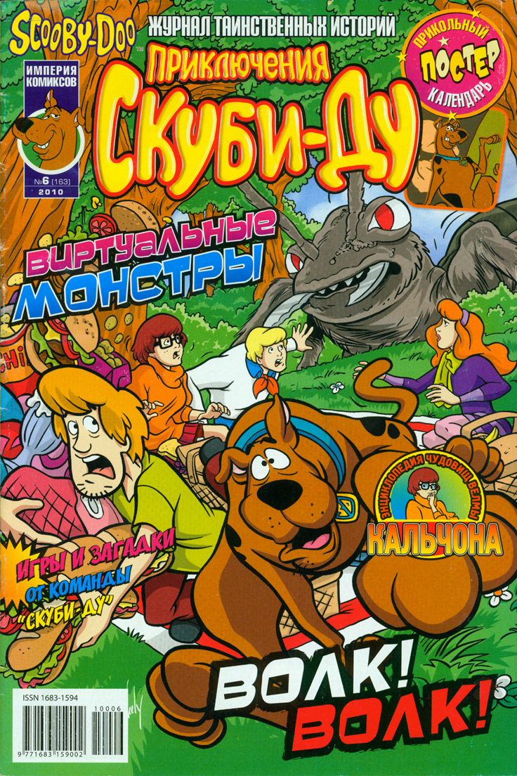
My Cover Art Used On A Scooby Comic In Russia!


A Scooby collector named Jim emailed me recently and told me that he saw one of the covers that I did for Scooby-Doo used on a Russian Scooby comic! Wow! I'm truly global now! I think this is the furthest I've ever seen my art go. Thought I'd post this as it's neat to see how Scooby is written in Russian. The cover was originally used here in America on Scooby-Doo #132. I've heard there is an Egyptian Scooby comic series as well, so maybe they'll use one of my covers too!

Saturday, July 24, 2010

It's Strawberry Fields...For A Little While...

Oooooohhh! A blog post with a good title that works for it. I had the Beatles song going through my head as I was uploading up the pic. This past Thursday I found out that I was approved again (or re-approved?) to draw Strawberry Shortcake. I had to do a new audition for it since they changed the look for her in 2008 and they aged her a smidge more than the version I originally drew back in 2004-05. I guess to compete with the newer version of Dora the Explorer as they both now look like they could almost exist in the same universe. I like the newer face and head shape designs and she's just as colorful as she ever was. I did several pieces for an audition and there were little tweaks here and there, with only two major complete redraws. It takes a bit to get the female body language down and the ultimate feel of it again, but once you figure out how to do it, it's not hard. I've done so much male dominated work the past few years that you do lose something when you go back to a feminine one.

I'll post some of my sketches, and the changes that were made, since some like to see the process of how this all gets done.

Thursday, July 8, 2010

DelcoMag Has An Interview With Me This Month!

I was the main feature story in the July 2010 issue of DelcoMag, which is a newspaper magazine that covers a large area in these here parts! It's got a pretty full and meaty interview... It should be in the surrounding Delco areas today or tomorrow depending on how it's delivered to the different zip codes. It was going to have the picture of me with the stuffed Scooby as the cover, but the publisher wanted a pic of me with a Scooby drawing, so I now use the other pic for my FaceBook profile. Also has a Scooby coloring contest in it as well for the little ones...