Monday, January 27, 2014

SCOOBY Capstone Books Are Out!

I got my comps from Capstone the other day of the four Scooby "You Choose" books I worked on all last year! They are now out (at least on Amazon.com! I've set up a sidebar on my blog that will lead you right to them!) They are $6.95 each in the stores. Amazon sells them right now for $6.25 each. Not a big discount but these books are NICE! Beautifully printed on heavy glossy paper and they have a great binding to them.

I also got the hardcover versions of them as well, which are the Library Editions that libraries would order so that they would hold up over time from kids borrowing them. These hardcovers are pricey but well worth the price! Beautifully done! The cover art really pops and looks just like they did on my computer screen.

I'm currently working on Books 5 and 6 right now and they should be going to the printer in March.

Wednesday, January 1, 2014

ALFIE In The Sun

Every morning, if the sun is poking in, Alfie jumps off the bed and lays in the sun patches on the carpet. He'll lay there for about 10-20 minutes and then turn over or move into the shade to cool off for a bit before getting back into the main heated area. These were taken back in early October. These last few weeks he's been under the covers with me and doesn't want to get out as it's been really cold of late! He is spoiled I know.

SCOOBY-DOO Capstone 4-Book Series Covers!

Here's the final cover art as they will appear in spring of 2014!  I don't know how much they'll be in the stores but they are slightly thicker books as they are mostly text. I really like the title designs for each book!


SCOOBY-DOO Original Final Cover Art For Capstone!

On April 1st, I started working on Book 1 of Scooby for Capstone Publishing. This is a series of "Choose Your Own Adventure" Books so I did the cover art and 10 interior illustrations for each book. They came out exceedingly cool as I had complete control of the art and had a great designer from the publisher who designed some great title logos. All in all, I think these will be a hit! Warner Brothers was really thrilled with them and they loved the sample copy that was on exhibit at San Diego Comic Con this past summer. It's nice to see this type of book make a return as I remember reading "Choose Your Own Adventure" books growing up. I still have a mint set of the Indiana Jones ones that were done in the early 80s and I have a Batman and Superman one here as well.

I'm posting the original final full cover art as you'll see the final art as I submitted it since it would wind up being really tight in the final layout and some parts were covered up. They were tough to design as I didn't want any key art to be covered up and so they took a while longer to design than the interior pages. When I colored these I did do some line holds for color and kept the background paints fairly simple as I knew some parts would get covered up. I did do some color overlays on the Book 2 cover as the Gang is out in the woods and for the sake of it being a cover I lightened it up so that it didn't look as dark as it would be. For Book 3 with the Minotaur I created a separate file for a bush pattern that I made. It took me several tries to get it to look like a bush you'd see in an outdoor maze. As I say, I was quite happy with how it all came out and I made the final deadline about two weeks early! Enjoy!

SCOOBY-DOO #39 Comic Cover

Here's the printed cover version for Scooby-Doo #39 which was done in early fall. It had gone through several changes but came out all right in the end. Candace Bell at Heroic Age did the colors. Thanks to Captain Blue Hen Comics for getting me copies of the final printed books as it seems DC Comics stopped giving out comp copies to the talent so we now have to fend for ourselves to see how the work turned out. Ah, comics...

SCOOBY-DOO #38 Comic Cover

 Here is a Scooby-Doo comic cover I fit in this year for issue #38. It's a Elvira parody that had Daphne dressed up as Elvira. I think this was done in late summer. Candace Bell at Heroic Age did the colors. Unfortunately, DC Comics covered up my name on the bottom and then also gave the credit for the cover on the inside to someone else. Ah, comics...

2014 Is Here...

Well, to those who wondered, I'm still here. 2013 turned out to be a year of work and a year of personal growth as I learned some new skills. I was going to post and talk about it all but every time I went to go to this blog and type I felt like the old guy in the Dunkin' Donuts commercials and went "Time to make the donuts" and then said the hell with it.

Since April 1st, it's been a fast year. December was here before I knew it and it was also the month I could sit back and decompress after the last nine months of adventures. It was a summer of money flying out the window on a new furnace, a new roof with some fixed rafters, and a health scare with Alfie that wound up being ok in the end, though he is getting older and he now needs some medicine everyday to keep his liver and gall bladder healthy.

I had completed the Capstone 4-Book Scooby-Doo deal I had and as I was finishing up the last book they offered me two more to do, with another very possible two more after that. I'll be posting the covers soon. I also worked on Phineas and Ferb stuff as well in the gaps but mostly I worked on Scooby to keep my time open for my other adventure which was twice a week and about 10-20 hours more a week of study time. Anyway, here I am and I don't know if I can say renewed because I still feel tired, but we can hope the new year is going to be good! Here's hoping!

Friday, April 12, 2013

Current Goings On...

Not much to write about of late other than I did finish the roughs for Book 1 of Scooby for Capstone on Wednesday and am waiting on approvals and waiting for the cover specs to work them out. I have some exciting layouts that I did for the book so I'm eager to hear what is said.

Other than that, Alfie went to the groomer yesterday morning after a series of cancelled and remade appointments with his groomer, Bobbi, who was having some family issues and a fire in their basement. I would have waited for her anyway, though they offered someone else to trim him, but she's been doing Alfie's grooming since he was a baby so why change. Less stress for him since he knows her. Anyway, I was to take him in finally yesterday at 10:30am and they called at 8:30am to see if I could bring him in earlier, like right now! There was more drama for her so I got up and took him over. She was only doing four dogs today so she could leave early. He was good in the car going over as I guess he was tired as we were both in bed sleeping soundly till the phone rang. I haven't been up that early and moving in a while. It's great to have an artist's schedule.

After he was done, I came home and did my taxes for the year to finally get them out of the way. Then I was cleaning the studio today with some dusting and running the vacuum cleaner around.

Sunday, March 31, 2013

SCOOBY-DOO Is Now At Capstone Publishing!

Tomorrow, I will start work on a new 4-book Scooby-Doo series with Capstone Publishing that I signed the contracts for this past week. I finally got the first manuscript on Friday and will read through it all and start work this week as this four book deal will take me up to the first week of September or so to complete (I may finish earlier though)! They will see the light of day in Spring 2014! I will post more about them as they get done one by one. Capstone has done some great books of late with the WB licenses and they do a nice package and presentation so I think Scooby fans will like this new series, which will feature the classic look of the Scooby Gang!

The art will be like the Scooby-Doo Mystery Incorporated book I did in late 2010 for Scholastic in that the character art is flat color with character shading on top but the backgrounds won't be painted this time. This series will have the backgrounds drawn in ink and colored, which is more comic book-like though it's all single spot illustration so I have to approach each image like it's a cover image to get the most impact. I think I'll do it all as one layer as well. When I did the Mystery Incorporated book I did everything as layers so that the character art was separate. This won't be as involved but should still be fun! Anyway, that's the big news of late and the first adventure starts this week!

SCOOBY-DOO MYSTERY INCORPORATED - DVD Cover Designs

Here are the concept sketches I did for the second season DVDs of Scooby-Doo Mystery Incorporated. Officially it was Season 2, Part 1 which would have had the first 13 episodes of that second season. Two of these designs were picked and locked in and put on final model. One was to be for the domestic release of the DVD and one was for the International DVD release. Since the series ended up being a failure and now as Cartoon Network spends the next few days burning off the final episodes of the second and final season episodes, I'd thought I'd post what I did since in the end "the Suits" at WB decided not to use them anyway and did an entirely different concept late in the game and only did one piece of art instead of two. They probably figured why spend more time and money on something that they didn't think was bringing in the numbers. I was, in fact, told that the Scooby-Doo Mystery Incorporated Season 1 - Volume 1, which had the first 4 episodes of the series, was the WORST selling DVD in Scooby's history. So bad in fact, they recalled them and ripped out the disc and then inserted them as a freebie when you bought the Direct-to-DVD Scooby movie "Music of the Vampire". I forget when these were drawn exactly but I think it was around this time last year when my father was at the end of his life. I was given really loose concept ideas to follow and these are what I came up with. Some of these I really liked. I added the logos and some gray tone to help with separation so that the suits would know what they were looking at since most of the time they couldn't find their asses in the dark with both hands and a flashlight.

The first cover concept above was the first one I did. It also would wind up being my favorite though it does seem like typical Scooby-Doo situation and doesn't stand out as much in terms of being new and fresh. I think we tend to rely on the cliche when we do things as they are what people are expecting. If you go too far outside the box, the audience doesn't follow. Shaggy and Scooby are always the focus and should be the focal point. I added the dramatic lighting on it to help sell the concept and I think it works really well.
This second concept has the Gang in the Mystery Machine driving at high speed and maybe ready to crash. In the background you see the legs of Hot Dog Water as she was bouncing around in the back. Certain elements were to be shown such as the map and outside the window were to be two scenarios. One was the Crystal Cove sign being broken and flying in pieces to give the idea that the van and blasted through it. It didn't work as well so I did a second version with Professor Pericles flying outside carrying one of the pieces that they gang was looking for. Hence Shaggy holding the map to tie it together. There is no sense of speed to it though as that would be done later with some blur. I had it worked out in my mind as to how I would do it but you don't want to spend too much time on these concepts as they could be canned later on.
The third concept I didn't like, as to my mind, it had issues with spacing. I think there is too much negative space around Shaggy and Scooby and they should be a bit bigger but the layout of the cover in terms of being a portrait-sized image limits you sometimes so you have to place things on a forced perspective and layering things so that they come at you. Hence why the second concept works since the action is there and facing you. This one seems a little boring to me from this angle though if I turned it (and I did, in fact, try to) to another angle some other aspect would get lost or wouldn't be correctly viewed or understood. The giant chicken foot didn't work coming straight at the viewer and I also lost Freddie, Velma, and Daphne as they got pushed further back or were taken off completely. I followed the original concept and it looks ok here, but somehow the sense of action isn't working for me. Sometimes these are difficult puzzles to figure out so that each element that must be shown is there.
The fourth concept I partially liked. I think something about the viewpoint of the shot maybe doesn't translate for me. All we see are two arms looming forward from the Big Baby Clown. Maybe more of him was needed like a leg or maybe framing him so that we got more of a side view, but I was following the original concept so it is what it is. The donut shop setting and gag of Fred and Shaggy eating donuts works very well while the place burns. This would have been a pretty colorful piece in the end. It was chosen as the International cover, though abandoned in the end.
This fifth concept was done as the original art direction dictated. The problem is one that you can see for yourself. It focuses more on Shaggy than Scooby, and Scooby is the star of the thing so he should be the one holding onto the giant hammer in this semi-forced perspective. Otherwise though the concept works for me fine and I liked the drama of it. It was hard to figure out the spacial concerns of it and how it all fit together but it worked well.
So I then was instructed to do a sixth one with Scooby as the focus and it works fine as well. This was to be the Domestic cover and was locked in and put on final model. Then... sometime over the next several weeks I didn't hear anything and you sure don't get any answers till you complain and press people on what the status is of the thing is, and that was when I found out that WB decided at the last minute to try another concept with the Gang underwater and they went with that. It was taken from the design studio I did these for and done internally at WB. So go figure... I was paid for it all, but it's Hollywood and we know how they work, though I think a lot changed when they realized that they didn't have much faith in the series as a whole. Hence all the hiatus points and weird time slots over the 52 episodes. Hell, Cartoon Network still has over half a second season left of The Looney Tunes Show to air and that's on hiatus as well again. You just lose momentum and the viewers move on at a certain point. I've heard numberous stories over the years from inside Cartoon Network and wonder why they even bother showing original, new cartoons when half of the corporate structure there doesn't like cartoons to begin with. Sheesh...

Thursday, March 28, 2013

New Exciting News Coming Soon!

I've got some new exciting news for Scooby fans coming soon! I just signed the contracts for it and will let you know what is going on and how all of my summer (April to September actually) will be devoted to Scooby once again! This all works out nicely as I've got something else going on two nights a week that I'm starting April 1st and will give me more options in life as well.

UPDATE: As for those who've been reading my blog and my "Purging and Downsizing" posts, I thought I'd let you know that I sold ALL my music CD's to a reseller in New Jersey and was able to get $1 a piece! Woo! I was quite happy to get it as I stated that music CD's are HARD to get rid of and I had to go to Jersey to do it as there are no used shops in Philly! I did keep a small box of CDs though that were rare, limited editon, or out of print.

Since my last posting in late February, I've just finished a Phineas and Ferb job that I just posted about in which I crossed the 100 page mark. I've also been going through and cleaning up around the house and selling stuff to keep my downsizing going. I've been donating quite a few books to the local library as well since they have no budget to do much of anything. I've also joined some local online yard sales to help sell stuff and you'd be amazed at how many DVDs I see for sale. It's a buyer's market for sure and I'm glad I was able to get rid of most of mine.

As April approaches, I never did get to use the snowblower this winter. Had it all ready to go twice and we got nothing or the storm's left a dusting and I used the shovel to clear it off. It's been two years since it was last used! But still nice to know that it's there if I need it. This past winter has been mostly all high winds.

Also approaching is Free Comic Book Day, which I'm not doing again. This year will mark the one year mark since my father died so I opted out as I don't know how I'll feel. Him dying the day before the event hasn't tainted it but my love for the comic industry has been so low that I just got tired of doing it. I figured I did it for seven years or so and I've been taking a break from it the last three years. I was asked earlier this year if I wanted to do it but I didn't feel like it.

PHINEAS AND FERB - For Your Reading Pleasure!

Since I crossed my small milestone, I thought I'd post one of my favorite P and F stories I drawn! The opening splash page is also one of the best ones that I've drawn as well. Lots of excitement as Candace blows up the house! You can right-click on each page and open them in a new window to see them bigger!


PHINEAS AND FERB - MY 100th PAGE!

On March 14th, I passed a small milestone! I drew my 100th comic page for Phineas and Ferb for their magazine! The page itself wound up being a cool splash page with Agent P fighting rogue ex-agent Dennis The Bunny. I am now at a total of 111 pages drawn for P and F as I write this.

Thursday, February 21, 2013

My Regular "Go-To" Art Supplies!

I was drawing late one night and I happened to look over to my left at the table with my art supplies that sits next to my light table. My hand automatically goes over to the table and briefly glances at the type of pen I'm picking up but I never really looked at the table set up as a whole or in depth as to what I use mostly. My actual art supplies for the last ten years have mostly been the same. As all artists do, we pick out what we like and keep using it throughout our careers (as long as they keep making it) and I find myself sometimes apprehensive to trying something new. If something works for you, why change?

Over the years I've distilled a lot of my working process down to make it simpler and between the work being more digital than physical nowadays I have found myself using a real short list of items to draw with. I've been asked before what I use to draw so for those interested, here's the list with pics. From the first pic on top you can see that my regular tools only take up about a third of the table top in total.
1) PAPER - Mostly I've been using copy paper sized at 8.5" x 11" or the 11" x 17" size for bigger sketches (like comic book pages). Even my final art for Scooby-Doo (for the comic books at least) have been draw on normal copy paper. It's cheap and works well. Probably not great for the archival or collector mentality but it's the raw material to get a project done. I buy one box with reams of paper in it at Staples once a year or so for like $35. For the bigger paper, I buy a ream of it when I need it. I can burn through letterhead paper with roughs and thumbnails and if I screw up I grab another sheet real quick from underneath my light table where it sits and continue on.

For final art that I want to have a slick, professional look to it, and it may be a piece that I'll be selling later on, I use the Borden and Riley #234 Paris Bleedproof paper for pens. It comes it many sizes and prices can vary depending on where you buy it. I have ONE store in my area that carries it. Go figure. I like this particular kind of paper as it's light and thin, easy to work with on the light table, and also works extremely well with the pens that I ink with. I've rarely had any bad moments with the paper in terms of smudging and bleeding. Sometimes things happen but overall this paper works fantastic. It's been my "go-to" for many years. When I did comics I also would prefer to use this paper over the company's art board. The quality of paper is lacking of late there and I'd rather use my own. If I do a cover for Scooby-Doo for DC Comics, I'd use their art board as the people who buy original art like it on the "official" board. That is changing though as a lot of artists use what they like instead.
2) PENCILS - I can use anything really though I seem to gravitate to a 5H lead for breaking it down and keeping it clean and then a 2H or an HB to bring out the details. Depends on my mood. Sometimes I'll pull out a purple ColErase pencil or even a ball point pen and do the whole deal. At this creative point in drawing, it's about mood and getting it onto the page. You can tweak it later on with another piece of paper. If I do a convention or I'm on the road, I tend to use the 5H and HB.
3) ERASERS - I have three. A kneaded eraser, which is one that I use most often. You can bend and shape it to get into tiny corners and every artists uses one. You can't be an artist without one. Next is a Staedtler Mars Plastic Eraser, which is great for really cleaning up with as it leaves very little residue or crumbs and does in some cases a better job of overall cleaning than the kneaded eraser. My third eraser is a yellow gum eraser, which I use the least and it does a good job at times but leaves a lot of crumbs in its wake. The Staedtler Mars eraser is good for other things as well, such as when you take the price sticker off an item you bought and there is some sticky residue on the item left over. The gum eraser sometimes does the job but a Staedtler Mars one works superb at taking off the residue without hurting a book cover or toy box. A Sandford 'Magic Rub' eraser is great too!
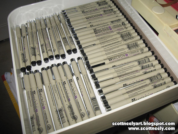
4) MICRON PENS - My main stay for ten years now. I came to using these mostly after I had to trash a TON of Scooby and other work back in 2001 or so. I used to work with Le Pen, which was a superb pen marker that worked supremely well on Garde Silk paper which was very smooth. The Le Pen would glide across the paper and leave such a clean line that it almost gave the look that you did it digitally. It was great for style guide work as well where you needed strong clean lines that held up even when it was enlarged. But then you had the downside... All the work would fade from black to brown to light brown to almost invisible. It was great in terms of producing high quality work but the worst in creating original artwork that you wanted to be around in five years. It would in some cases start fading in one year depending on where you stored the original art. Hence, I lost a LOT of original artwork that I had to trash as it was faded and would be hard to sell. Live and learn.

So I started using these Sakura Micron Pens in early 2002 or so and I've been using them ever since. The ink has never failed me nor faded over the years as they have archival ink in them. You can go through them though as keeping the points sharp can be a chore. I use the .005, .01. .02, .03. .05. and .08. I seem to use the .01 for fine work and the .08 for thicker lines most of the time. I use the others accordingly to what I'm doing. If I do a convention and I'm doing sketches there, I use these pens for doing a fast ink job over top of the pencil rough.
5) PITT BRUSH MARKER - My main inking tool for doing sketches, final art, and larger pieces for the last seven to eight years. The ink is solid and archival and the brush points while delicate leaves a nice strong line. It takes some skill and practice to use it right without destroying it. I usually use the frayed brushes that still have ink in them, but are no longer good for fine inking work, to fill in large solid black areas of a composition as well. Sakura who makes the Micron Pens also makes a brush called the Sakura Brush Pen and it's in the same tan colored container that the Microns come in. I used to use that brush mostly in the beginning. It has a finer point to it and takes a while longer to master. I'm not sure why I stopped using it and went with the PITT Brush Marker instead. It may have been because I like the shorter brush that the PITT had and it was easier to manuever around. I recently went back and tried the Sakura Brush Pen (as I still have a few boxes of them here) and it seemed like I was out of practice with holding and using it. It takes some time to go back and relearn to use something. They are still superb brush markers but I think my hand has grown comfortable with the PITT.
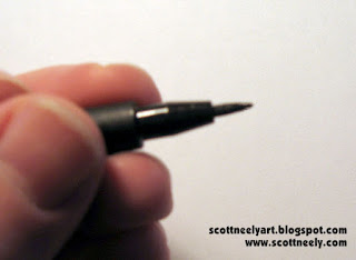
Also the PITT has an upside that the Sakura Brush Pens don't have. Once they become a bit frayed (and you'll know it when it happens) and don't give you the ink line you want you can take some tweezers and pull out the brush point from the pen tip and flip it around. As you can see from my pics, you have a perfectly good NEW point now to use by simply flipping the brush and sticking it back in. The hard part is leaving the right amount of brush length exposed though. The further out it is, the more control it takes to use. The further you stick it in, the tighter your control will be. So now you can get some extra usage from the pen before it gets moved to the pile where they are just used to filling in large black areas on a drawing.
Another trick is that you can twist the end cap off of the pen (sometimes it's hard to do!) and then drop a few drops of ink in from an eyedropper if the PITT Brush is dying on you. Now the only problem with this is that the ink doesn't match. This can be an issue for some but if you are doing convention sketches or roughs with it, it won't matter. I've not used India Ink in so many years that I can't tell you if it's still any good or not. Most artists I know complain about it being watered down or not black enough. Quality control is lacking with India Ink so you might be able to find something you like. At any rate, this is a good little trick to getting the most from your PITT Brush Marker before you have to throw it out.

BUY THE STUFF YOU LIKE IN QUANTITY - I only mention this as it's cheaper! If you buy them at three pens at a time, you are spending more money on them in the long run. I go to Dick Blick's Art Supplies on the Internet and buy them buy the box. The pens I use come 12 to a box and you can store them away. As you can see from the pics above, I keep extras close at hand on the right side of my light table in the first drawer of my artist's shelf. I lay them out according to size so that I know what I'm reaching for even when I'm not looking. When you have gaps that show up from pens dying out you know which ones to replace and which ones you use the most. You keep a bunch of them in stock so that you can keep working straight through. If you're on a deadline, it takes time out of your day to drive to an art store that carries them and you wind of paying more in some cases. The price for the Microns that I see at most art stores is $2.69 a pen so that adds up. If you buy them in bulk you can get them for less than $2.00 if they are having a sale as well. I buy more of the .08 Micron Pens than I do the others since I tend to use them for quite a lot of things.

6) RULER - My little plastic ruler has been with me for ten years at least! It was cheap and did the job. It was clear plastic as well so it makes working with easier. The downside is that it had no lip or inking edge to it so if you ran a brush or marker next to it chances are you'd create a smudge when you pulled the ruler away. This happened a lot and so I got the idea of raising it off the paper by taking a piece of thin cardboard and cutting it so that it fit underneath the ruler and left an inking edge on both sides. I added a little piece of tape to hold it into place on either end of the ruler and it's been my "go-to" ruler for a decade. I sometimes replace it when I run an X-acto blade next to it and the blade accidently cuts into the plastic and creates a slightly off line. They are cheap and easy to replace. I have other rulers here that I use but this little one is the one I use the most. I think they cost like .49 cents. I do have two other big rulers that I use for doing longer lines naturally but this little one gets me through all the details!
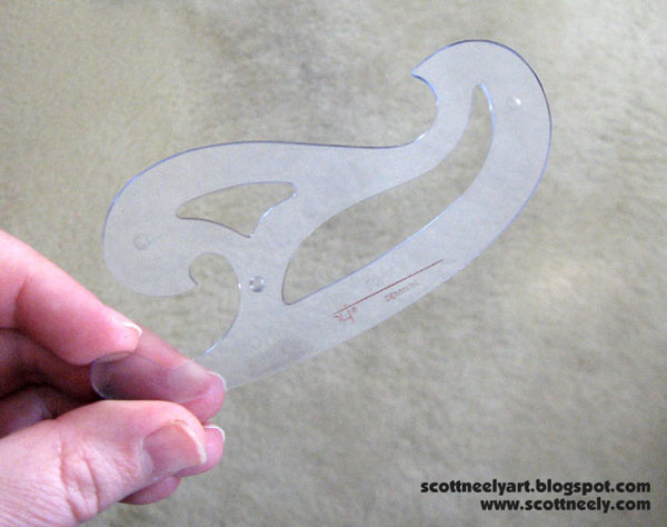
7) FRENCH CURVES - Ah, the tool of the Jedi. If you are well trained in using a French curve they will serve you well, young padawan. I have many here of different shapes and sizes but I use basically three different ones. One of them (pictured above) has an inking edge built in. If you can buy them this way, make sure you do. It makes life easier! Otherwise...
You have this kind of French curve where I had to do the same thing that I did to my ruler and tape some cardboard to the bottom of it to raise it up off the paper. I use the outer edges mostly for bigger stuff so it's looked like this for ten years too! It's my second "most used" French curve.
And the third is my little worn and faded French curve. It's been with me now for over 20 years or longer and we've been through many jobs over the years together. I got it back when I was in high school when I was taking mechanical drawing. It has never failed me and I take it, my ruler, Micron Pens, and PITT Brush Markers to conventions. My little tackle box of supplies. We've seen many a battle and it has never failed me. My tried and true. I've used it so much over the years that it's like a swiss pocket knife for me in terms of working. I use a side here and a curve there, and a little piece here and there. You learn wield it like a blade and you know how to use it. It's why it sits on my table where it does. I have not bought another one so I have no idea what these small ones cost.

This, of course, is all based on my years of doing art and what I feel most comfortable drawing with to get the best results. It's up to you to try and experiment with the many supplies out there to see what works for you! Buy the supplies that feel good in your hand and give you the best results... and then buy a lot of it in case they stop making it!