Showing posts with label Original Art. Show all posts

Sunday, September 6, 2026

ED, EDD N EDDY Sketches!

Here's some old scans of sketches I had done of Ed, Edd n Eddy for fun. I would do a couple sketches each morning when working on the Eds stuff to get into the rhythm of it. 

Eventually, that small pile of sketches became a big pile (from all the licenses I worked on) and I got the idea to place them into small flip-through portfolios and take them to conventions with me to sell to fans. Some would also be given away for charity events, giveaways, or I would throw in one or two if you bought original comic page art from me as a "Thank You."

All drawn on cheap letterhead paper and inked with a Pitt Brush Marker and a couple Micron Pens. 


Tuesday, August 18, 2026

REPOST: Drawing ED From ED, EDD N EDDY!

Here's a drawing video I did of my favorite Ed from Ed, Edd n Eddy! 

Ed's a bit confused in this drawing since he can't find his jawbreakers that he hid in his room. 

Penciled with a 5H, then tightened up with an H lead, and then inked with the Pitt Brush Marker on cheap letterhead copy paper. 

In real time, about 9 minutes long. I was moving! 

Vimeo link: https://vimeo.com/11248298 

Here's a scan of the original artwork!


Thursday, August 13, 2026

Grim Sketches today... literally!

I found some old warm up sketches that related to the The Grim Adventures of Billy & Mandy comic I drew for DC Comics. I posted the full comic on my blog back in April.

You can see me working out Grim's gesture and basic pose for panel 2. Not sure why he's angry in my sketch and happy in the story. He was always yelling at the kids on the show. I still work out my ideas on cheap paper before I decide what to go with.

Doing warm ups can get you going and I usually sketch stuff that relate to the project I'm working on at the time. Some artists draw whatever they want to draw for fun to warm up but I usually like to get in a rhythm by working on backgrounds, props, or supporting characters. Some make it into the project and some don't.


Wednesday, August 12, 2026

FROM THE ARCHIVE: Blue's Clues - My audition sketches!

BLUE'S CLUES! Drawn on some left over "artsy" paper I had in my studio (feels like a parchment paper of some kind in my hand) and a purple col-erase pencil! 

These are 2003 audition pieces for Nick, though I didn't get it. I did these right after Steve left the show (Steve Burns, who was a fan favorite and left to go off to college in real life) and they just introduced a new actor to play his younger brother Joe. 

This license was a LOT of work, especially when you had to produce the full color art! Nick gave me a thick How-To booklet and CDs with the fabric patterns to lay in after you built everything in Adobe. 

In hindsight, I'm glad I didn't get it at the time as my Adobe skills weren't at the level this work required. Also, you needed to submit the final art with everything organized and labelled as they wanted it to be. It would have taken me longer to do and they needed someone with a bit more speed. 

It was still fun to draw though! I love the simplicity of it!


Tuesday, August 11, 2026

THE BATMAN - Pencil sketch based on the 2004-2008 cartoon series

Batman pencil sketch on cheap copy paper with an HB pencil lead! Based on the animated version of him from The Batman done in 2004-2008!


Sunday, June 21, 2026

My Regular "Go-To" Art Supplies! (Updated for 2026)

A slightly updated blog post of my original post from 2013! Not much has changed! This is just for doing physical hand-drawn art. I may do one about the digital aspect of it another time.

I was drawing late one night and I happened to look over to my left at the table with my art supplies that sits next to my light table. My actual art supplies for the last 25+ years have mostly been the same. As all artists do, we pick out what we like and keep using it throughout our careers (as long as they keep making it) and I find myself sometimes apprehensive to trying something new. If something works for you, why change?

Over the years, I've distilled a lot of my working process down to make it simpler and between the work being more digital than physical nowadays I have found myself using a real short list of items to draw with. I've been asked before what I use to draw so for those interested, here's the list with pics. From the first pic on top you can see that my regular tools only take up about a third of the table top in total.

1) PAPER - Mostly I've been using copy paper sized at 8.5" x 11" or the 11" x 17" size for bigger sketches (like comic book pages). Even my final art for Scooby-Doo (for the comic books at least) have been draw on normal copy paper. It's cheap and works well. Probably not great for the archival or collector mentality but it's the raw material to get a project done. I buy one box with reams of paper in it at Staples once a year or so. For bigger paper, I buy a ream of it when I need it. I can burn through letterhead paper with roughs and thumbnails and if I screw up I grab another sheet real quick from underneath my light table and continue on.

For final art that I want to have a slick, professional look to it, and it may be a piece that I'll be selling later on, I use the Borden and Riley #234 Paris Bleedproof paper for pens. It comes it many sizes and prices can vary depending on where you buy it. I have to order it online as no local art stores exist or the ones that do don't carry it. Go figure. I like this particular kind of paper as it's light and thin, easy to work with on the light table, and also works extremely well with the pens that I ink with. I've rarely had any bad moments with the paper in terms of smudging and bleeding. Sometimes things happen but overall this paper works fantastic. It's been my "go-to" for many years. When I did comics I also would prefer to use this paper over the company's art board. The quality of paper is lacking of late there and I'd rather use my own. If I did a cover for DC Comics, I'd use their art board as the people who buy original art prefer it to be drawn on the "official" board. That is changing though. 

2) PENCILS - I can use anything really though I seem to gravitate to a 5H lead for breaking it down and keeping it clean and then a 2H or an HB to bring out the details. Depends on my mood. Sometimes I'll pull out a purple ColErase pencil or even a ball point pen and do the whole deal. At this creative point in drawing, it's about mood and getting it onto the page. You can tweak it later on with another piece of paper. If I do a convention or I'm on the road, I tend to use the 5H and HB. 

3) ERASERS - I have three. A kneaded eraser, which is one that I use most often. You can bend and shape it to get into tiny corners and every artists uses one. You can't be a true artist without one! Next is a Staedtler Mars Plastic Eraser, which is great for really cleaning up with as it leaves very little residue or crumbs and does a better job of overall cleaning than the kneaded eraser. My third eraser is a yellow gum eraser, which I use the least and it does a good job at times but leaves a lot of crumbs in its wake. 

The Staedtler Mars eraser is also useful for other things as well, such as when you take the price sticker off an item you bought and there's some sticky residue left over. The gum eraser sometimes does the job, but a Staedtler Mars one works superb at taking off the residue without hurting a book cover or toy box. A Sandford 'Magic Rub' eraser is great too! 

4) MICRON PENS - My main stay for 24 years now. I came to using these mostly after I had to trash a TON of Scooby and other work back in 2001 or so. I used to work with Le Pen, which was a superb pen marker that worked supremely well on Garde Silk paper which was very smooth. The Le Pen would glide across the paper and leave such a clean line that it almost gave the look that you did it digitally. It was great for style guide work as well where you needed strong clean lines that held up even when it was enlarged. But then you had the downside... All the work would fade from black to brown to light brown to almost invisible. It was great in terms of producing high quality work but the worst in creating original artwork that you wanted to last. It would in some cases start fading in one year depending on where you stored the original art. Hence, I lost a LOT of original artwork that I had to trash as it was faded and would be hard to sell. Live and learn.

So I started using these Sakura Micron Pens in early 2002 or so and I've been using them ever since. The ink has never failed me nor faded over the years as they have archival ink in them. You can go through them though as keeping the points sharp can be a chore. I use the .005, .01. .02, .03. .05. and .08. I seem to use the .01 for fine work and the .08 for thicker lines most of the time. I use the others accordingly to what I'm doing. If I do a convention and I'm doing sketches there, I use these pens for doing a fast ink job over top of the pencil rough.

From my time at conventions, I found that a lot of artists use them! 

5) PITT BRUSH MARKER - My main inking tool for doing sketches, final art, and larger pieces for the last 22+ years. The ink is solid, archival, and the brush points while delicate leaves a nice strong line. It takes some skill and practice to use it right without destroying it. I usually use the frayed brushes (that are no longer useful for fine inking work) to fill in large solid black areas of a composition as well. 

Sakura, who makes the Micron Pens I talked about, also makes a brush pen called the Sakura Brush Pen! I used to use that brush mostly in the beginning. It has a finer point to it and takes a while longer to master. I'm not sure why I stopped using it and went with the PITT Brush Marker instead. It may have been because I like the shorter brush that the PITT had and it was easier to maneuver around. They are still superb brush markers, but I think my hand has grown too comfortable with the PITT. 
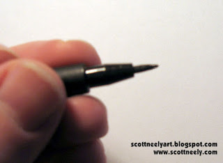

Also, the PITT has an upside that the Sakura Brush Pens don't have. Once they become a bit frayed (and you'll know it when it happens) and don't give you the ink line you want you can take some tweezers and pull out the brush point from the pen tip and flip it around! As you can see from my pics, you have a perfectly good NEW point now to use by simply flipping the brush and sticking it back in. The hard part is leaving the right amount of brush length exposed though. The further out it is, the more control it takes to use. The further you stick it in, the tighter your control will be. 

Another trick is that you can twist the end cap off of the pen (sometimes it's hard to do!) and then drop a few drops of ink in from an eyedropper if the PITT Brush is dying on you. Now the only problem with this is that the ink doesn't match. This can be an issue for some but if you are doing convention sketches or roughs with it, it won't matter. I've not used India Ink in so many years that I can't tell you if it's still any good or not. Most artists I know complain about it being watered down or not black enough. Quality control is lacking with India Ink so you might be able to find something you like. At any rate, this is a good little trick to getting the most from your PITT Brush Marker before you have to throw it out. 


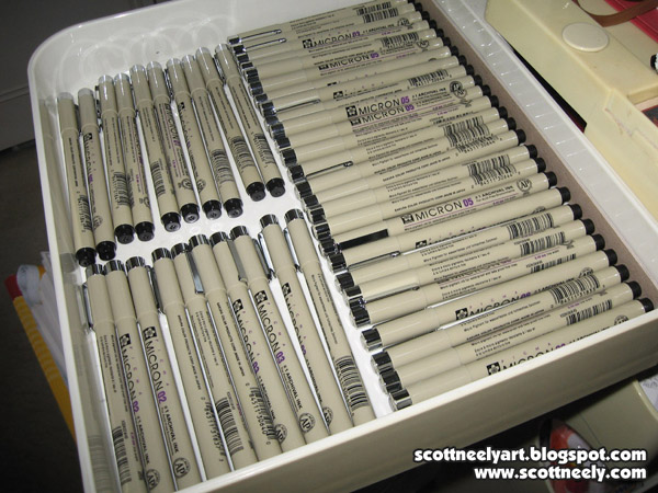
BUY THE STUFF YOU LIKE IN QUANTITY - I only mention this as it's cheaper! If you buy them at three pens at a time, you are spending more money on them in the long run. I go to Dick Blick's Art Supplies on the Internet and buy them by the box. The pens I use come 12 to a box and you can store them away. As you can see from the pics above, I keep extras close at hand on the right side of my light table in the first drawer of my artist's shelf. I lay them out according to size so that I know what I'm reaching for even when I'm not looking. When you have gaps that show up from pens dying out you know which ones to replace and which ones you use the most. You keep a bunch of them in stock so that you can keep working straight through. If you're on a deadline, it takes time out of your day to drive to an art store that carries them and you wind of paying more in some cases. Microns are pricey these days too! Buy them in bulk or if they're on sale. I buy more of the .08 Micron Pens than I do the others as I tend to use them for quite a lot of things like signing books.


6) RULER - My little plastic ruler has been with me for 15 years at least! It was cheap and did the job. It was clear plastic as well so it makes working with easier. The downside is that it had no lip or inking edge to it so if you ran a brush or marker next to it chances are you'd create a smudge when you pulled the ruler away. This happened a lot, so I got the idea of raising it off the paper by taking a piece of thin cardboard and cutting it so that it fit underneath the ruler and left an inking edge on both sides. I added a little piece of tape to hold it into place on either end of the ruler and it was my "go-to" ruler for a decade. They are cheap and easy to replace. I do have two other bigger rulers that I use for doing longer lines naturally, but this little one gets me through all the details! 

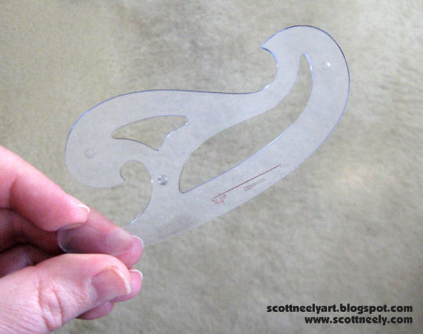
7) FRENCH CURVES - Ah, the tool of the Jedi. If you are well trained in using a French curve they will serve you well, young padawan. I have many here of different shapes and sizes but I use basically three different ones. One of them (pictured above) has an inking edge built in. If you can buy them this way, make sure you do. It makes life easier! Otherwise... 

You have this kind of French curve where I had to do the same thing that I did to my ruler and tape some cardboard to the bottom of it to raise it up off the paper. I use the outer edges mostly for bigger, wider curves. It's my second "most used" French curve.

And the third is my little worn and faded French curve. It's been with me now for over 30 years or longer and we've been through many, many jobs over the years together. I got it back when I was in high school when I was taking mechanical drawing. It has never failed me! I've used it so much over the years that it's like a Swiss-pocket knife for me in terms of working. I use a side here and a curve there, and maybe a little piece here and there. Over time, you learn to wield it like a blade and you know how to use it with your pencils and pens. It's why it sits on my table where it does. I haven't bought another one since so I have no idea what these small ones cost nowadays.

This, of course, is all based on my years of doing art and what I feel most comfortable drawing with to get the best results. It's up to you to try and experiment with the many supplies out there to see what works for you! Buy the supplies that feel good in your hand and give you the best results... and then buy a lot of it in case they stop making it!


Wednesday, June 10, 2026

SCOOBY Sketching

Sketching Scooby one evening under the warm soft white bulb above my drawing table creates an added layer of mood and atmosphere! 

Sketched on cheap paper with a black col-erase pencil. I like to add line weight to my sketches (if I have the time) as it makes them "pop" more off the page. Normally, I just draw it flat and do the embellishing when I ink, but when sketching for fun I like to spend more time on it. 

Monday, June 8, 2026

Anyone remember the TV show DINOSAURS?

Anyone remember the prime time TV Show Dinosaurs (1990-1994) from the Jim Henson Company?

This is a sketch of the Baby Dinosaur who basically would steal the show. "Not the Mama!" he would yell as he banged his father, Earl, over the head with a pot or pan or something. The show was a great satire for current events.

I found this black Conté Crayon sketch on newsprint paper I did back in '93 or so in my archive. I had the action figures for the show and I held the Baby Dinosaur figure in one hand as I drew it with the other. It was a fun warm-up sketch before I went to a an evening life drawing class back then.

I liked sketching with a Conté crayon more than working with normal charcoal sticks.

Conté crayon was drawing tool that was composed of compressed graphite (or charcoal) and mixed with a clay base which made it harder and more stable to hold without breaking. It came in long 2" thin rectangle sticks. It was no muss, no fuss in my mind and gave you a slick, smooth result.

To keep your fingers from getting any residue on them, you can wrap some masking tape around the stick where your fingers would hold it. As the stick wears down, you can unwrap some of the tape to expose more of the stick. See all the cool stuff you learn here?


Monday, May 11, 2026

One that got away: Care Bears

Back in 2003, I did an audition for the Care Bears. I didn't wind up getting it and not sure why it didn't go past this initial sketch at this point. It was for a book project and you can see the open gap in the center that would go into the fold of the book spine. You can't have anything important get lost in spine of the book so you really have to design a complicated layout well. Each bear was to be doing something in the shot and the art direction would tell you what else was to be drawn.

Overall, I still like it. It was all to be done as vector art (like my work for Strawberry Shortcake) and I think I got this audition either before or during the early stages of my work on Strawberry as other potential future work either down the line or in-between. As I mentioned in a previous post, you try out for stuff and some things you get and some things you don't. I was probably relieved that I didn't as doing it all as vector art would be really time consuming! My Strawberry Shortcake art was extremely complicated vector art though I'm proud of all that stuff and how it turned out.

For you process junkies, the art was drawn on cheap copy paper and then I lightboxed it onto a clean sheet of copy paper by inking it all with a Micron pen to finalize the art. With licensed work, it had to all be there and "on model" first time out as license holders usually do not want to have to go back and forth with revisions and lose any time. If you can nail it the first time with minimal instructions, it's all good! American Greetings owned both properties at that time and if you got in with them they would just keep feeding you work, which is always nice!


Monday, July 28, 2025

One From The Past: Master Ham-Ham!

I was going through some old art and teaching supplies that have been sitting in my basement the other night. Along with my easels and giant clipboards, I found two pads of 18" x 24" newsprint (in varying stages of aging) that had been sitting in a giant portfolio carry bag. One was barely used at all and I decided to keep it as the paper still looked okay. The other pad, however, looked mighty weary from battle... and it still had some drawings in it!

Laying on top of the pad was the drawing of Master Ham-Ham! 

I barely remember doing it till I thought about it. It's been a long time since I taught a class. Master Ham-Ham has been sitting for quite a while, but he still looks happy!

If I liked any drawings I did during a class, I would gently tear them out of the pad and place them at the front of the art pad to save them (if I didn't give them to students who requested them, which is what happened most of the time). It had to be from 15 years ago when I taught a class at the Delaware College of Art & Design, which is sadly no longer open.

When I uncovered Master Ham-Ham after all this time, I immediately felt his presence! He's loaded with appeal! Strong lush ink lines that make him pop! I still like him!

I decided to post this as I got some great response from people I showed him to, and to explain where he came from.

____________________________________ 

I always thought it was much easier to learn how to do animation character or prop turnarounds based on looking at an actual three-dimensional object or toy. You subconsciously pick up things like construction theory, shape, and form much easier. You can see why decisions were made at a design level because the final design is right in front of you. If you created something out of your head, the front or 3/4 front view would be fine but there would be problems trying to get it to match up when you did the other views. Turnarounds are not easy, and you only get good at doing turnarounds by doing them. 

I would bring a box of small toys into class (or one big toy) and let student draw them. Complex toys, simple toys, etc were all fair game. Which brings us to Master Ham-Ham...

I had a Dancing Kung-Fu Fighting Hamster toy made by Gemmy Toys in 2001. You squeezed his hand and it triggered the toy to start spinning his nunchucks and moving while it played the 70s song "Kung-Fu Fighting". It was a cute novelty toy.


Master Ham-Ham came from pushing students to move away from the realistic approach we had taken in the first drawings and to then do a more simplified redesign, all while retaining his character and look. Appeal is always key. 

After the students did their versions, I would then do my own version so they could watch me. I used gray magic markers to simulate pencils and then a black magic marker to finalize and ink the drawing. This approach still works as I would talk through my thoughts as I did it. My simplified design used the basic character construction that most of the Pokemon characters all had.

The "Warrior of the Round Wheel" tag line came from the fact that I used a round spinning cake stand (or wheel) in class. You place the stand on a stool and let the students sit around the stool in a circle and draw what was on the stand. I'd spin the stand every 15-20 minutes to give them a different view. We worked faster as I wanted them to pick up the main points of doing turns without getting bogged down in details.

For more complex turns, I'd give each student a toy or object and they could hold it in their hand and draw from it close up. It's still a great way to learn!


Monday, June 30, 2025

Found MICKEY MOUSE work I did at the local Dollar Tree stores this weekend!

My old Mickey Mouse Clubhouse work is STILL out there for sale! AMAZING!

I ran across EIGHT books that were on sale at two local Dollar Tree stores this weekend! They were published by Bendon and reprint my work that I originally did for Dalmatian Press. These don't give me a credit line on them, but I have all the original Dalmatian printings which did. I picked these up for my archives as I didn't know these particular books even existed. They take the same batch of work I did and reprinted the hell out of them with new cover art.

I also took a new pic of the original art that I did of Mickey and friends in his car. I still have the original and this piece of car art has been used an infinite number of times. This artwork and the piece I did of Mickey and Pluto in an airplane have seen the most usage since I originally drew them. 


As you can see the original art has a background on it that is different from the printed version. When I did the art originally it was for a giant Mickey floorpad coloring book that Dalmatian produced. Then they erased the background and just kept the car art and multi-purposed it for coloring pages, activities, mazes, etc in normal-sized coloring books. 

A lot of the character art I did for Mickey had some kind of background on them (which were mostly later removed) but to maximize some later art, we then did the character art and backgrounds separately. That way a designer could mix and match later on based on the dynamics of different page formats. 

When I finished work on Mickey I moved right into doing a ton of Winnie the Pooh work. My Pooh artwork is all single character art and background plates. That art is still some of the best I've ever done and why I've kept all my originals.

Finally, I'd like to mention that the only downside to working with separate pieces of line art is dealing with all the bad tangents that can happen when you drop a character onto a background plate. It doesn't happen with color so much, but with pen and ink drawings it can be brutal. You then have to take some time to slightly adjust some elements on the background plate as the character art can't be touched.

_________________________________________ 

UPDATE! Through the glory of eBay I found a Mickey Mouse coloring floor pad and one of the pics for it (that the seller took) was of the page with my art! What are the odds?! 


Here's the original usage of my art before the background was removed to repurpose it! This is exciting to show you! This particular coloring floor pad was produced in 2013 and was yet just another reprinting of the art I did. I do have the original floor pad somewhere that was first printed in 2007 (and all the first original printings for this material had my name in them), but they really kept my art in print for many years!

As a final note, here's another page from this pad that features what I talked about before where the character art and backgrounds were two separate things that were then combined to make up scenes. Mickey and Minnie are two separate pieces and the background of Mickey Park was a separate piece. I don't remember if the clouds in the sky were on that background plate but even they could have been taken from another background I did to make a scene work.
 

Monday, June 16, 2025

MY OWN SKETCH CARDS ARE HERE!

I decided to make my OWN sketch cards! Last month, I designed TWO sketch card trading cards: one with my personal branding and the other is a certificate of authenticity. Once I settled on the final design I went to a local printer who printed it all on the paper I provided! 

The end result is that they look BEAUTIFUL! You get a sketch card on card stock and then a COA on a lighter stock paper which will both go together in a single trading card top loader! The presentation for this product is TOP NOTCH! 

I can now do my own sketch cards of anything I want or I can do commissions! 


Monday, May 19, 2025

SUITS LA was cancelled...

Well, that was short-lived! Suits LA was cancelled last week, not that many probably noticed, and I never did know if my art was seen in Samantha's office or not. I watched the first two episodes and that was a real struggle to get through. I contend that NBC should have paid me to sit through them. When episode three was to be aired I thought life was just too short to sit through another and so I didn't see the remaining episodes. I like Stephen Amell ('cause he was Green Arrow) but he sure looked weird clean-shaven. It was kind of off-putting. That and the bad writing... I almost got to a point of just contacting actress Rachelle Goulding on her Instagram and asking her direct if she saw my art on her office set. Sadly, I never got up the gumption to do that.

Oh, well...

Did any of you happen to see it on TV? If so, let me know.

Sunday, April 20, 2025

HAPPY EASTER!

Happy Easter to all! This is a pen and ink drawing that was colored with pastels and some magic markers! Pastels do give it a softer, more lush look and feel which I really like.

Saturday, March 1, 2025

A piece of my art to be on the TV spinoff show... SUITS LA!

In November 2024, I was approached by the acquisitions department for the NBC Universal TV Division. They wanted to use a piece of my artwork for the new upcoming spin-off TV show called Suits LA.

The piece of art they had attached surprised me as it was something that has been sitting on my art blog for 14 years! I had to go back and read my original post to remind myself about the circumstances of its creation. I posted it back on September 9, 2010 and it was titled "The Stuff That Dreams Are Made Of" - Maltese Falcon Sketch. I wrote the following:

As I was waiting for an approval on some sketches today, I did a still life drawing of the Maltese Falcon. I have a replica prop of it that I bought back in the mid 90's and it's a great conversation piece in my studio. Always been a fan of the movie as well so I thought why not sketch it. It's always better to do a still life of something you like as opposed to organizing a bunch of fruit on a table. It was penciled on cheap 11 x 17 copy paper and then lightboxed and inked onto good 11 x 17 art paper with a Pitt Brush Marker. After I scanned the artwork I then used a Photoshop brush to create a light gray background behind it to give it some push. Possibly I'll color it later on but it looks kinda cool in black and white. 

In 2025, it still looks cool to me! It still jumps off the page. The show deals with criminal law in the entertainment industry, so I can see why it might have appealed to one of the creatives on the show as even the small Google search pic that leads to my blog really pops!

I signed the release for them to use it (I retain all the rights to it) and then inquired about what episode it might be in so I could watch to see it on TV. I received a reply back that my art was to be part of the permanent set decoration for Samantha's office (Ted Black's ex-girlfriend / rival lawyer played by Rachelle Goulding) on the show and that I might be seeing it often!

I have no idea how the art will be used. I've seen the first two and not seen it yet. We did see part of her office in Episode 2, but the tight camera angles didn't show much. Keep an eye out if you watch the show!

To be updated!