 Here's a quick Scooby sketch I did in about 20 minutes (whipped out on copy paper and inked with a Pitt Brush Marker) as I'm prepping to start a new Scooby project tomorrow where Mystery Inc. goes to yet another carnival and finds yet another mystery that needs solving. Who'da thunk it?! Is there ever a slow day in Coolsville?

Wednesday, August 18, 2010
Quick Scooby Sketch!
Here's a quick Scooby sketch I did in about 20 minutes (whipped out on copy paper and inked with a Pitt Brush Marker) as I'm prepping to start a new Scooby project tomorrow where Mystery Inc. goes to yet another carnival and finds yet another mystery that needs solving. Who'da thunk it?! Is there ever a slow day in Coolsville?


HAL & AL "ALL-STAR CONCERT" Poster!
 Since I posted the cover with Hal & Al on the new issue of City Social advertising the concert, I thought I should post the actual concert poster ad!
Tuesday, August 17, 2010
HAL & AL On The New Cover Of CITY SOCIAL Magazine!
 Hal & Al are on the new cover of City Social magazine this month advertising the Hal & Al All-Star Concert this fall! Saints quarterback Drew Brees will be there as a special guest as well! I had to go back into the photo and add the flesh tone to the Hal & Al costumes for it. From previous posts, I've talked about the steps that I have to do to fix any photos of them since cameras always make them look more white than flesh color. The flash on the camera and the lighting setups keep whiting them out even in the most professional of photoshoot conditions. There are always touch ups to do afterwards. This was fairly easy work as opposed to last year's free CD cover art (posted here last year), which required a lot of work done to it. This cover is a great shot though!
Monday, August 16, 2010
My Cover Art Used On A Scooby Comic In Russia!
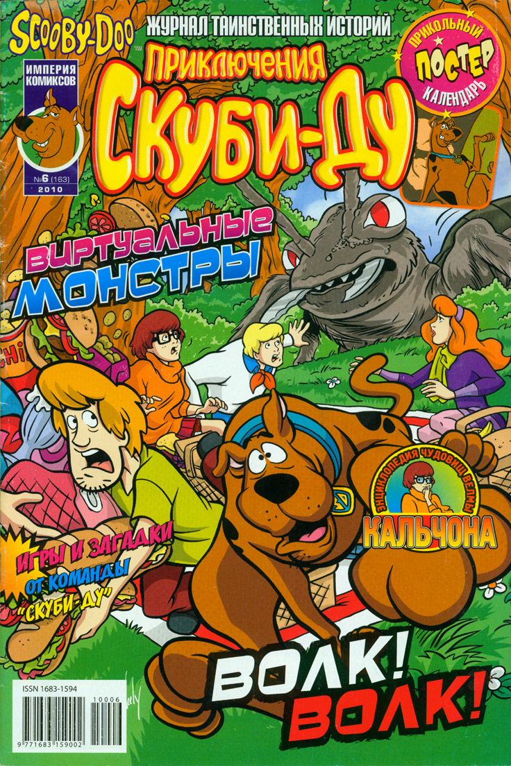
A Scooby collector named Jim emailed me recently and told me that he saw one of the covers that I did for Scooby-Doo used on a Russian Scooby comic! Wow! I'm truly global now! I think this is the furthest I've ever seen my art go. Thought I'd post this as it's neat to see how Scooby is written in Russian. The cover was originally used here in America on Scooby-Doo #132. I've heard there is an Egyptian Scooby comic series as well, so maybe they'll use one of my covers too!
Saturday, July 24, 2010
It's Strawberry Fields...For A Little While...
 Oooooohhh! A blog post with a good title that works for it. I had the Beatles song going through my head as I was uploading up the pic. This past Thursday I found out that I was approved again (or re-approved?) to draw Strawberry Shortcake. I had to do a new audition for it since they changed the look for her in 2008 and they aged her a smidge more than the version I originally drew back in 2004-05. I guess to compete with the newer version of Dora the Explorer as they both now look like they could almost exist in the same universe. I like the newer face and head shape designs and she's just as colorful as she ever was. I did several pieces for an audition and there were little tweaks here and there, with only two major complete redraws. It takes a bit to get the female body language down and the ultimate feel of it again, but once you figure out how to do it, it's not hard. I've done so much male dominated work the past few years that you do lose something when you go back to a feminine one.
I'll post some of my sketches, and the changes that were made, since some like to see the process of how this all gets done.
Thursday, July 8, 2010
DelcoMag Has An Interview With Me This Month!
 I was the main feature story in the July 2010 issue of DelcoMag, which is a newspaper magazine that covers a large area in these here parts! It's got a pretty full and meaty interview... It should be in the surrounding Delco areas today or tomorrow depending on how it's delivered to the different zip codes. It was going to have the picture of me with the stuffed Scooby as the cover, but the publisher wanted a pic of me with a Scooby drawing, so I now use the other pic for my FaceBook profile. Also has a Scooby coloring contest in it as well for the little ones...
Friday, June 25, 2010
State Representative William F. Adolph, Jr. Gave Me A Nod!


After the tornado that we just had here in Delaware County which left us without power and shut down businesses for over a day, I got a nice little happy moment today in the mail! State Representative William F. Adolph, Jr. sent me a little note in the mail over seeing my pic in the Springfield Press this week! Thanks, Bill!
SPRINGFIELD PRESS - Third Time Is A Charm!
 Being the "King of All Promotion", I made it into the Springfield Press a third time in three weeks! This time, the pic is of myself and my graphics teacher, Robert Preston. I gave it to them the week after the award but they ran it now since they had a lot going on. Can't have enough promotion though so it's always great!
Saturday, June 19, 2010
My Online Store Is Up & Running!
 My online store is up and running right now and about 100 pages of comic art, 58 sketches, and 36 comics or so ready for purchase! More stuff will be added when I get it scanned and ready! Anything purchased also get a certificate of authenticity with it as well so you know it's signed by me as well.
Wednesday, June 16, 2010
Back In The SPRINGFIELD PRESS!
 The Springfield Press printed my little article of sorts on my thoughts that I wrote a few days after my SHS - Arts Hall of Fame induction! I gave them a picture too but they just ran the article in this week's paper. I originally gave them a photo and the article as filler if they wanted it, so they were nice enough to print it. I was going to post it here as text but now I can post the actual printed newspaper instead. Click on the image naturally for the readable version.
Tuesday, June 15, 2010
This Weekend I Met Julie Newmar - Still The BEST Catwoman!
 Since I posted my pics of Adam West and Burt Ward way back in the archives, I'd thought I'd post these as well. This past weekend I went to Wizard World Philly and met Julie Newmar on a rare east coast convention appearance! She was, and still is, the BEST Catwoman ever! I got three pics signed by her for my collection and they now reside next to my Adam West and Burt Ward ones! I now have Batman, Robin and Catwoman from the cast of the original 1966 Batman TV series. My goal of meeting all three is now complete! They had a nice set up for them as Adam and Julie were in two booths side-by-side and across from them was the Batmobile from the show. Luckily I got better shots of the Batmobile when I first met Adam and Burt at a show in New Jersey so I didn't bother taking any this weekend since the convention hall had lousy lighting.
 Last year, I met Erin Grey who was Wilma Deering on the 1980's Buck Rogers in the 25th Century series and she was great! I didn't post the pics, but maybe I will add them to this post. Anyway, at this year's show, was Buck himself: Gil Gerard! Got to talk to him and he signed this pic for me. Other than that, I bought 4 comics and got outta Dodge. My main and only reason for going was to meet Julie and there's wasn't much that I was looking for in terms of comics or toys so I left early. It was crowded though and the dates for next year are set.
Saturday, June 12, 2010
WARNER BROS CONSUMER PRODUCTS - Hanna-Barbera Concept Gallery Art
 I think I posted these on my other places like FaceBook but never here where they should be. So here we go... Last September I was invited by Warner Bros Consumer Products to participate in "The World of Hanna-Barbera" Gallery, which was a selection of artists who were asked to come up with new takes or new styles based on the HB characters. You had to do at least one of these three: Scooby-Doo, Tom & Jerry or Yogi Bear. These were the licenses they were pushing for this year so they wanted some new ideas. After you did one of these, you could then do anything else from the HB catalog.
You could do them in any style or medium. They didn't have to be on model and they wanted you to express yourself. You could make a Scooby-Doo out of bottle caps or Atom Ant out of matches if you wanted. The main idea was that these might inspire some new products or style guide art that could be used at some point. Being that I always kind of look for something that might sell or something that I would buy if I saw it, I went to the young kiddie route and came up with Baby Yogi and Baby Scooby! I think they came out great and WB seemed to love Baby Yogi so who knows... I thought the baby line would be great for these characters since Disney has had such success with their Baby versions of Mickey and Winnie the Pooh.
*
For process junkies, these two were penciled and then scanned and just colored under the pencils to keep the clean rough look. It's a nice look for concept art.
 Now L'il Scooby was actually the first thing I did and took the most time as I was thinking it would be cool for maybe a line of beginner reader books or something. I know he does seem like a Scrappy-Doo clone, but Scrappy is crappy and this is more of an ideal way to go. Even WBCP won't let you draw Scrappy for a job since they kind of disavow him. I never liked Scrappy's design either and thought Scooby "jumped the shark" when they started introducing Scooby's family in general. I had a young kid version of Shaggy to go with this as well. I wanted something cute and something that would appeal to women or mothers and that was what I aimed for.
*
This one was penciled, inked and colored with a painted background.
 I'll post some of the other pencil roughs soon.
 Monday, June 7, 2010
BEST CONSUMER CONTRACTORS - Graphic Design Work
 Joe Valentino from Valentino's Beautiful Home Center wanted to form a group for contractors who could network and find new work as a unit instead of as separate contractors. So the first thing I had to come up with was a logo design for the group.
He liked the ribbon design best, but here is another version that didn't get used. I thought I'd post it for people who like to see the process...

Here's some alternate ideas that I was thinking of while trying to keep a simpler corporate look.
 Here's yet another logo with just text that locks together. We liked it and decided to use it for some things and you'll see it on the tri-folded brochure.
Here is the design for the group's letterhead... we kept it simple.
 Then the art for a No. 10 envelope...
 Here's the final design for a tri-folded brochure mailer... I like the design a lot and wanted to add some punch to it so that it would grab you. All the text was given by the client as to what they wanted to say so it was just a job or organizing it all and making it pop...
 And here's the inside of the brochure. I like this design a lot as well and the way it grabs your eye! It came out great! It has the feel of a mission statment or a diploma with the border and logos working together.
 Then finally, the client wanted a simple two-folded informational brochure that could be printed quick at a local printer as a teaser while the one above was printed on high gloss paper stock at the high-end printer in California that we use normally for everything else. I like the cover of it and how it grabs your eye. It should always attract the eye from a few feet away. If no one picks it up, it's a bad design in my eyes.


 Then the art for a No. 10 envelope...
 Here's the final design for a tri-folded brochure mailer... I like the design a lot and wanted to add some punch to it so that it would grab you. All the text was given by the client as to what they wanted to say so it was just a job or organizing it all and making it pop...
 And here's the inside of the brochure. I like this design a lot as well and the way it grabs your eye! It came out great! It has the feel of a mission statment or a diploma with the border and logos working together.
 Then finally, the client wanted a simple two-folded informational brochure that could be printed quick at a local printer as a teaser while the one above was printed on high gloss paper stock at the high-end printer in California that we use normally for everything else. I like the cover of it and how it grabs your eye. It should always attract the eye from a few feet away. If no one picks it up, it's a bad design in my eyes.

VALENTINO'S BEAUTIFUL HOME CENTER - Graphic Design Work
 Here's a bunch of design work I did for Valentino's Beautiful Home Center! Starts with a business card design and then a letterhead.
 Then a flyer for the grand opening...
Then a coupon/ad for them. I like this one as a design since if you cut the coupon and the picture off, the right side of the ad still works, which makes it a good layout.

Then they wanted a two-sided letterhead flyer to advertise what services they offer. I had to add to the illustration as it was just a house before and then wanted to have a commercial type of business building next to it. I think it came out great and the colors really pop! The illustration was all done in Adobe Illustrator as well. The rest was done in Photoshop.

 And then I did a little two-sided mini-flyer that could be inserted into something like a brochure.

Subscribe to:
Posts (Atom)