Since quite a few of you have asked about the interview I did for DCM a month ago on here and in emails...here it is! I forgot about it till I was reminded and then I had some problems tonight trying to copy and paste the Word Doc text into Blogger since you can't do it using Explorer apparently so I had to go back to use my old AOL browser to post this. Go figure. I hope the formatting works ok for this... and away we go!
SCOTT NEELY
Springfield’s Own & Professional Artist For Scooby-Doo & More Talks About Art, His Induction Into The SHS Arts Hall of Fame, And His New Drawing Videos.
By Jennifer Faith Stiefel
For years, I bet you have been enjoying
Delaware County Magazine’s comic strip feature
The Adventures of Alfie. The signature of artist S. Neely is neatly displayed on the artwork. Did you know that Scott, a Springfield High School graduate, is also a licensing artist for Scooby-Doo! Last November was the 10th anniversary of Scott drawing the curious canine. He has also worked on other licensed properties such as Johnny Bravo, Powerpuff Girls, Winnie the Pooh, Pokemon, Strawberry Shortcake, Shrek, Mickey Mouse Clubhouse, and many others. His client list includes Warner Bros, Cartoon Network, and Disney! He is currently doing art work for MegaMind, which is a new film from Dreamworks coming out this fall.
Since 2006 he has been the visual creator and production designer for the Hollywood Hal & Rhinestone Al live-action TV and stage show. It is a project that he co-created with Scott Innes (the voice of Shaggy, Scooby-Doo and Scrappy-Doo) and musician Jim Hogg. To learn more about Hollywood Hal & Rhinestone Al, visit
http://www.halandal.com/. Check out Scott’s website at
http://www.scottneely.com/ to see more of his work, listen to his podcasts, read his blog, and watch videos of Scott in action drawing! The site is jam packed with great info! His online store is up and running as well and he sells original art, comics and other things he’s worked on.
Scott has also been the editor, head designer and writer for NMA Magazines, Inc., which includes
Delaware County Magazine!
DCM: Did you attend a formal art school?
Neely: I'm self-taught. I learned everything at Springfield High School from two years of mechanical drawing and two years of graphic design. That was all I needed really. Never got less than an A+ and I had a teacher, Mr. Robert Preston, who pushed me. I think watching movies and reading comics helped greatly in shaping my artistic eye towards design as well. I did go to a local community college in 2001 to learn the digital end of art by taking Photoshop, Illustrator and Quark classes.
DCM: What teacher at Springfield pushed you to succeed?
Neely: Mr. Preston was mostly it. He was my graphic arts teacher in 11th and 12th grade. He didn’t push as much that you would notice it or be bothered by it. I think my own desire made me push as much as he gave. I would walk in and he’d hand me the new assignment and it’d be like “Well, this is what they’re working on and this is what
you’re working on.” Now, I’d look over and it’d be the
same thing as everybody else, but the inference that I got was that Yoda wanted me to lift
four rocks with the Force when everyone else only had to lift two. I never got less than an A+. It got to a point in my mind where I couldn’t get less so I had to make it good.
He also got me a job working in the graphics room during the summer before my senior year after I did great at “Celebration of the Arts”. I think winning several ribbons in competitions showed that I had the chops or work ethic so he asked me if I wanted to work there that summer. It sure beat washing dishes or some other lame job so I took it. I did all kinds of design work and printed stuff up for the local schools. There were like 3 or 4 students who worked there and we did stuff like letterheads, notepads, calendars, etc. Whatever forms or materials that the school needed to use during the year we made. They always get the students to produce that kind of work instead of sending it out to be done. It’s a true “in-house” department.
DCM: Was it Delaware Community College where you learned how to do the digital end of art?
Neely: I went to DCCC for one year back in late 2000 to about the end of 2001 to learn the digital end of art. Then in 2007 they gave me a ‘Rising Star’ award! Another kind of cool moment since I only went to college for a year and I got an award. I took Adobe Photoshop, Adobe Illustrator and Quark. Back then it was all about Quark and now it’s Adobe InDesign. I worked with a designer in New York City at that time and her name was Monicka Clio Sakki. I worked with her a lot and she kept after me to learn the digital end. She always kept saying, “I’m telling you, once you learn it, you’ll never go back.” She was right, so I have to credit her with that. We worked so much together that people thought we were dating as well. I do pretty much all my stuff digitally nowadays, as that’s what the industry requires in most cases. She also gave me the best piece of advice I ever got… but that’s another story.
DCM: Do you remember what your very first art project was in high school and do you still have it?
Neely: Amazingly, you ask this question… I
still have the binder with
all my graphic design work from 1988-1989. Never threw it out, though the heat and where it was kept, has hurt some pieces in it. I still have all my first place ribbons in mint condition from “Celebration of the Arts” from that time too. They were the first real awards I was ever given, or rather, earned. I guess they were special to me in a kind of subconscious way and I kept them safe. Now this was graphic design and not art per se, but my mother has saved a bunch of my old art from when I was little. I don’t remember much about the work I did in art class in high school since I kind of screwed around and didn’t take it too seriously, but I think I did okay there. I never saved any of it and comic or cartoon work back then was kind of put down by teachers in general as not being ‘real’ art.
DCM: When you first found out you were being inducted into Springfield High School’s Arts Hall of Fame, how did you react?
Neely: When I got the envelope, which I kept as well, I got it on February 27th. It sat in front of me as I worked on the computer and I didn’t touch it for hours. It sat there with some other junk mail and I thought maybe it was a donation envelope or something since my mother is part of the Springfield Historical Society, and I thought the school was hitting me up to donate! Ha! When I finally did open and read it I thought it was nice. It was a pretty big deal once I found out more details about it and how out of 75 years of the school being there, I was one out of 14 former students who were chosen to be inducted. There were 7 people who were faculty or teachers that were also chosen. So you had 75 years and thousands of students and only 21 people who I guess made something of their careers and then gave something back that made the final cut. So that alone made it a bigger deal. It was kind of like an ‘American Idol’ type of ratio. There was a lot of scrutinizing that also went on with each inductee and they had to be defended as to why they should be there from the people who had put forth their names. There were only two people who were inducted from the graphics section and I was one of them. So it was cool.
DCM: Before the ceremony, had you been back to the school since you graduated?
Neely: Quite a few times actually. I was a judge for about two years at “Celebration of the Arts” and then I also spoke numerous times for the students in the graphics section over the years. About every two years or so, I’d go in and do a talk. If Preston called and asked me to come in, I did it for him. Plus, I spoke at other schools, libraries, etc.
DCM: Have you ever taught your craft?
Neely: I have taught many classes of all ages in cartooning, drawing, or animation of some sort over the years. It was extra filler for my resume and it looks good to have it. I enjoyed doing it, but then I do get burned out on it and need to take a break from it for a couple years and recharge. I do a lot of speaking engagements for schools and libraries and that has been nice for promotional reasons as well as soup for the soul.
DCM: What was your very first paid artist position? And do you remember how you found the position?
Neely: This is hard to remember. I think it was around 1991. It couldn’t have been very important to me so I guess that’s why I don’t recall it as well. I did some drawings for an air-conditioning unit turned into a cartoon character. I think that was the start of initially trying to get work. I can’t remember that stuff as well, since I was looking towards the future. When it really started to happen in 1993 for me, that’s the stuff I remember like it was yesterday.
DCM: What would you tell our current art students within the Delaware County School Districts if you could reach out and give them advice?
Neely: Stick with it and if you want to do it that badly, nothing that I say will change your mind. You have to be happy in life and if you don’t enjoy your job, what’s the point? You will find your niche eventually and what you do well. You either can make it happen or you don't. It's all on you whether or not you win or lose.
DCM: Out of all of the characters you have illustrated, which one do you wish could jump off the page and actually come to life?
Neely: Hmmm… a naked Daphne and Velma would be interesting. Most male artists I’m sure would like a sexy naked woman drawing to leap off the page at them. It’s a movie scenario for sure. I don’t know. I never really thought about it. If I did, it would definitely be something that I own and not something that someone else owns like Scooby or Yogi. It would probably be my cartoon character of Moochy Munk who’s a monkey character I created for a story I wrote and drew that was in a Hanna-Barbera style. I’d say my cartoon version of my dog but he is based on my real dog, and even Hollywood Hal & Rhinestone Al whom I designed became real in the end when the full costumes were made. So I’ve already had it happen!
DCM: Have you ever thought of getting into animation?
Neely: It’s amazing how many people think we still animate in this country. Pixar and Dreamworks still do it here. Everything else is shipped out to Korea or some other place overseas. We do pre- and post-production over here and that’s it. We get it up and running and they do all the real work over there, and then it gets shipped back and we tweak it, and fix the pacing and tighten it up, and then air the shows. It’s been that way since the mid-70s when they started sending it out since it used to be way cheaper than paying an American to do it. All the WB, Cartoon Network and Nick shows that are on right now are all shipped out. Some stuff is done in Flash and kept over here, but very few exceptions. I’ve thought of doing pre-production, pre-visual or conceptual design work but the economy has a lot of talented folks out of work right now, so I’ll bide my time and stay in licensing…unless another opportunity arises. You can’t predict where life will take you.
DCM: You’ve also posted videos of you drawing Scooby-Doo and Ed, Edd ‘n Eddy on your website. What were these done for?
Neely: I had just bought the new HD Slide Flip Camera and thought it was a simple way to get some other promotion for myself. So I built a rig that hangs over my light table and I can record myself drawing when I feel like it. It’s more pressure to do good drawings when there’s a film crew over you waiting, so this makes it easier to just hit play when I feel in the mood. I’ve recorded some stuff at 2am so it’s nice to do it on my schedule. There’s really no editing at all since I’m still learning the software for cutting the files. It’s all in real time and not sped up. A lot of drawing clips on YouTube are sped up and you don’t get a lot out of them other than seeing someone draw really fast and if I want to see someone create something, I want it in real time to see the way they do it. There’s not any audio lessons though on mine since it’s hard to talk and draw at the same time, but it’s always neat to see an artist create something on a blank piece of paper. I may record some audio and insert it overtop of the videos where I explain what I’m doing and how I’m doing it. It’s gotten a lot of hits on Vimeo.com so I’ll be doing more. Some will be more educational as well.
DCM: How did you meet Alfie and how long have you had him?
Neely: Alfie 1 died in 2000. He was 17 years old and his body failed him. He was a great dog who had a long life. I waited for a few years since the work load was huge for me and then in 2002 my mother was the one who instigated getting another dog. I got a new Yorkie on April 13, 2002 from a breeder in Delaware. He came up to me and never left me alone when all the other Yorkies were doing their own thing so I knew he was the one. I was going to call him Scrappy since it fit him and his attitude, but I called him Alfie whenever he did something and it just kept slipping out, so I said the hell with it and he became Alfie 2. He will be 8 years old this year.
DCM: Finish this sentence: When you are busy illustrating, Alfie can be found…
Neely: …lying next to me or chewing on his bones and waiting till his next walk.

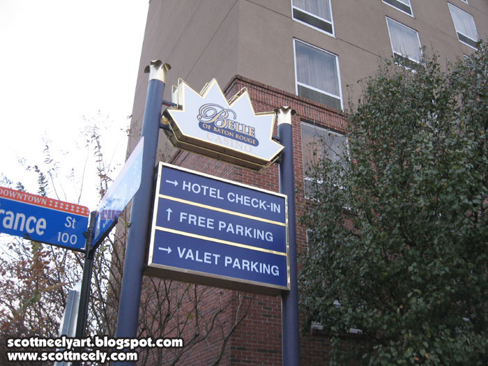 As I posted previously, I was down in Louisiana for a Scooby-Doo event in mid-December and the day after I got there (which was December 11), we had to do the 2010 Baton Rouge Christmas Parade. Hal & Al were once again the grand masters of the parade and we had a truck right behind the Mayor's car, which Mayor Melvin "Kip" Holden rode in. It was a three-mile parade that went through the main streets up to the Capitol building. As you drive it slow, you throw out treats, toys, trinkets, etc. to people who are all over the place. It was packed once it got moving. As we got there a little early to set up, Scott [Innes] and I went to get some coffee to kill some time and wound up at the Belle of Baton Rouge Casino, which is a HUGE place just around the corner from the parade start! Here's six pics of it here!


 And just past the check-in for the hotel it looked like a mall!
 It was huge and seemed to go on forever. It was a long walk to get some coffee once we got in there since the restaurant was on the other side of the place.
 About 5pm, we walked back and starting getting ready for the parade and these are some pics I took...
 After this float/car and the Mayor's car, we were in the maroon pick-up truck.
 Some pics of the other parade cars...


 LSU is so big in Baton Rouge that these two shaved the sides of their dogs with LSU TIGERS! Talk about team spirit. I hope the dogs were happy.
 Hal & Al ready to do a TV spot for the parade for the news as it kicks off!
 Scott Innes talking to Mayor Holden
 Some more pics before the parade started...

 Hal & Al pose with Mayor Holden and some kids for a photo op!
 Hal & Al with Mayor Holden!


.jpg)


