 Here's a new pic of Daphne I did. She looks all perky and sweet! I like the background colors as well. They seem to go well with her character colors. The colored pupils have grown on me and I do like them as they really do make the character design distinctive and different for the new show. All digital from start to finish. The only boring part I kinda of hate is the inking end of it as you just have to strap in, put your headphones on and get it done. But the end result is really solid! Enjoy!

Friday, January 28, 2011
Daphne Blake From MYSTERY INC!
Here's a new pic of Daphne I did. She looks all perky and sweet! I like the background colors as well. They seem to go well with her character colors. The colored pupils have grown on me and I do like them as they really do make the character design distinctive and different for the new show. All digital from start to finish. The only boring part I kinda of hate is the inking end of it as you just have to strap in, put your headphones on and get it done. But the end result is really solid! Enjoy!
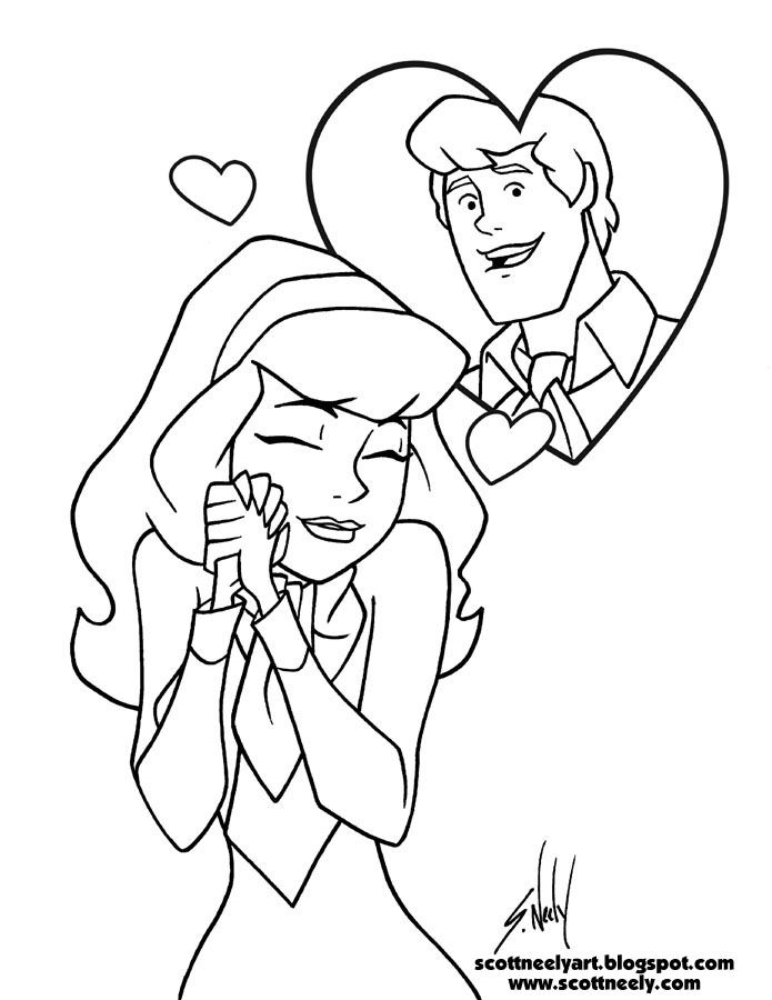
Thursday, January 27, 2011
Print Out Your Own SCOOBY-DOO Valentine's Day Card!

 A gift for readers of my blog!
 *
I created a Valentine's Day card out of the art I posted yesterday! I called it a Scooby Valentine's card even though Scooby isn't on it, but it works so well with Daphne and Fred since they have a relationship of sorts on the new series. I think it came out pretty cool and you can now download the two files and print your own out card! When you click and download the file, you'll see that it's a zip file with two PDF files in it: one is the outside art of the card and the other is the art for the inside of it.
*
To keep it simple I took the crop marks off of the files so it's just the art that you'll see. Open the inside art file first and print it out on letterhead sized paper (8.5" x 11") and then flip it over when it's dry and put it back in your printer. Then open the outside artwork file for the card and print that on the blank side. It should match right up fine! You may have to do a test paper to be sure that you have the paper turned the right way or else it will be screwed up when it prints. Otherwise it came out fine on my printer as long as the piece is centered. You can use card stock too if you so prefer. I kept it at a pretty universal size for a card so any card envelope should be able to fit it. Enjoy!
*
Click Here: Scooby-Doo Valentine's Day Card!
Wednesday, January 26, 2011
DAPHNE LOVES FREDDIE - Final Color
 Here's the final color art for yesterday's sketch I posted. I added a lot to it to jazz it up. I'm happy with it and it was shortly after I finished it that I got a great idea to take it ever further! I'll post it in a day for you and it will be something you can download and print out!
Tuesday, January 25, 2011
Something I'm Working On...
 Something I'm working on here for fun in-between Scooby. This is a hand drawn sketch for an idea I am pursuing in full color. Sketched on letterhead-sized copy paper and inked with a Micron Pen marker to give me a good solid line to trace in Illustrator. It will be digital from this point on as I ink it and color it. Some things I already know I want to change like Daphne's mouth and lips.
Monday, January 24, 2011
Monday With SCOOBY!
 Here's Scooby in the Mystery Incorporated style. Though he's not really different from how he was done before. It's basically the dead weight inking style that makes it the newer look. That and the slightly bent look to his collar instead of the perfectly round one I normally do. This piece and Shaggy from yesterday were inked together in the same file in Illustrator. Background was done in Illustrator there too. A complete digital piece for you computer people out there. Enjoy!
Sunday, January 23, 2011
Sunday With SHAGGY!
 I went back into my original inking sample of Shaggy that I did and decided to make a portrait piece of him and so I thickened the lines a bit to make them look more consistent with the final work I did and to match Scooby's lines for a portrait I'll post tomorrow. The basic idea was that if I printed these out at the same size they would all work together and look correct. If one had thinner or thicker lines that the others, it would stand out apart from the others and we don't want that. I was going to draw them together but opted to draw them separately as portrait style. I added his shading to him and made a cool little background that frames him. I draw that little framing thing behind him by hand usually when I do sketches at conventions but here I created a digital version. I love the background color and it pushes him forward. It's also amazing now that I go over some of the early pieces I did for Mystery Incorporated and see the little errors I made and fixed before I started by main project. It does take a while to hone the look and how things work so that you can get consistency out of your drawings. Velma seems to be the biggest hurdle as her glasses are thicker and she out of all of them was tweaked the most. As I said, the hardest part is the inking process since you are trying to make the lines thick but not too thick. Especially on the inner face lines and Daphne's lips always seem to be the worst thing to do. Sometimes you just have to eyeball it and print it out and look at it and then refix. There was one piece that I kept going back into and refixed three times before I was happy with it. Thankfully it was all digital so it made life easy. I can't imagine doing it with ink on paper.
Saturday, January 22, 2011
More DAPHNE From MYSTERY INCORPORATED!
 Here's another finished piece like my previous post. More Daphne and all digitally created. You can see all of her head on the original art and some more body but I cropped it more to work with this background. It came out looking cool. I like my roses on it. Remember you can click on the pictures to see them bigger. Enjoy!
Friday, January 21, 2011
DAPHNE From MYSTERY INCORPORATED!
 Here's a pic I did for fun of the new version of Daphne from Mystery Incorporated! I did it inbetween working on stuff for it as a warm up and then finished it up with a pretty background that has a Valentine's Day feel to it. She's so sweet!
For you artsy people, she was drawn completely in the computer. She started as a sketch in Alias Sketchbook Pro and then inked in Adobe Illustrator and then colored with the background done in Adobe Photoshop.
Thursday, January 20, 2011
Some MYSTERY INCORPORATED Stuff...
 Since I've been working on Mystery Incorporated I thought I'd start posting some stuff here. Above is a mock up showing an action scene. I did this around my 4th or 5th piece in of initial sketching the new look. The first couple pieces were just single characters and figuring out where changes were made and then I did some group shots. This was one that I thinked worked pretty well being that it was pretty confined in a given space. I didn't pursue it in color though.
After I drew a bunch of stuff for it, the next thing I had to do was master the ink line style and how I was to match it. It was fairly simple since the style guide is inked in Adobe Illustrator with the pen tool and you keep the setting on the pen tool so that you keep a rounded end on the end of every line you do. It's a dead weight line all around. It's a little bland with no depth but it works well for this look. Above is a test piece I sent to WB to show them what I did. The left piece is from the new style guide for Mystery Inc and the right is my sketch I did and inked to match the line thicknesses. It's a little tricky at first trying to get the right thicknesses so that they aren't too thick or too thin especially on the face details and especially on Daphne's lips, but since it's all done in Illustrator and every line is separate, it's fast and easy to fix. I make the nose lines and mouth lines just a hair thinner than the exterior lines so it doesn't make the line art too "muddy" or unreadable. I colored mine with Shaggy's base colors just to make him pop a bit more. Also I adjusted the chin hair a bit and made them slightly bigger. The style guide has the classic turns for the characters which are pretty standard and then some original poses which are much more exaggerated so I had to find an 'in-between" so that I could draw the thing with some kind of consistency. The exaggeration of the style guide is much different from the actual show so I found a middle ground that uses both that I think works pretty well. Enjoy!
Monday, January 17, 2011
2010 - An Interesting Year Of Work
 As I replaced my calendar for 2011 on the wall, I looked at all the crossed off x's on the days for 2010 and went back and noted all the stuff I worked on this year. It was certainly a diverse year for art and had some high points for me personally. In this order, I worked on:
 Shrek 4
Phineas and Ferb
Scooby-Doo (Classic Version)
Megamind
Strawberry Shortcake (New Version)
Scooby-Doo (Classic Version)
Winnie The Pooh (Classic Version)
Kung Fu Panda 2
Scooby-Doo Mystery Incorporated (New Show)
with some odds jobs in between. All in all, it was a slow summer but Spring and Fall were very busy. I could have had some more Phineas and Ferb work in early December but Scooby's deadline prevented me from taking it. 2011 is off and running and it's been all Scooby thus far and one new Scooby project I'm about to start in 2 weeks!
Tuesday, January 11, 2011
SCOOBY-DOO, WHERE ARE YOU? #5 Was Released This Past Week!
 Lots of stuff going on around here so I'd be remiss if I also didn't mention that this past week, Scooby-Doo, Where Are You #5 was released to your better comic stores. I just scanned a copy of the cover for this post since I got my copies from the printer last week. Has a cover by me (posted here before) and the first story in it is drawn by me. The second story in it is a reprint from the old DC series. Thought I'd share since it's a new release and the last two issues of the book have been nothing but reprints from 1997. So it's good to see fresh material again. I drew the story back in... September of last year as I recall...maybe it was August actually... the months seem to blend together.
I'm Listed In The New 2011 Pricing & Ethical Guidelines Handbook!
 I wanted to mention as well to any of my blog readers that I got my complimentary copy of the new 2011 volume of the Pricing & Ethical Guidelines Handbook from the publisher just after Christmas. I got my free copy as I helped out by giving them some pricing information way back in early 2010. I answered questons and pricing for about 4-5 things. My name is printed in the acknowledgments at the front of the book among all the other artists that were asked to participate so you know you get real artists who can give real on the job info and numbers. Members of the Graphic Arts Guild get a free copy with their paid membership (as I recall) but any artist, or anyone, can buy it at any decent book store in the art section. It's a great starting place for designers and illustrators to get a starting place as to how to price their work and also has a lot of great information for the artist as well. It was a great help to me when I was starting out on my chosen road.
SCOOBY-DOO MYSTERY INCORPORATED Has Kept Me Busy This Past Christmas...
 Hello all! I have not been neglecting my blog on purpose but work here has been busy as hell of late. I am still working on Kung Fu Panda 2 work and that is getting close to finally being done and I have been working on the FIRST licensed project for the new Scooby-Doo show called simply Mystery Incorporated. The first 13 episodes have aired and the early phases of WB getting the new show and it's new look out to the public in other venues is moving along slowly. This piece above is from the style guide, which is around 70 pieces and is pretty much the only thing out there right now besides the actual cartoon. This show has a slightly different art style from the classic look but it's kinda the same in spots when you start working on it. I will say that the style guide art is more exaggerated than the actual look of the cartoon so I've been finding a happy medium trying to combine the two. I got the gig back in late August or knew it was coming, but didn't start till late November (the week of Thanksgiving actually and after I did an audition piece for it) and it's been a deadline rush from the first day since there is no real set direction for the look of the license and I'm kind of creating the look for it since it's the first thing being done for the show. I am trying to keep it as faithful to the look and tone of the show as possible and I'm mighty happy with the results thus far and feel it's some of my best work I've ever done for Scoob. Also, after the initial pencil roughs that I drew by hand, everything after that stage is completely digital! The backgrounds have been the most fun to digitally paint and I've been moving between Adobe Illustrator and Photoshop in creating the work.
I had to work on the project as well while I was away down south for the Scott Innes event so that I could stay on my tight schedule but I've created a workflow that makes it easier to pump the stuff out now and it's moving along rather quick. I should be done by the end of January and I'll post some stuff then.
Also, since I had no time to really shop for people for Christmas I created a beautiful 11 x 15 print that's a piece that I've done for the gig and gave that out to a lucky few that I know as a Christmas gift. I kept it simple this holiday season... so the deadline rolls on and I'm back to Crystal Cove and getting some gas for the Mystery Machine as I approach the end of this adventure.
After that, I have another Scooby project lined up... Booyah! I've been so busy that I had to turn down a Phineas and Ferb job a few weeks ago. I hated to do it but it was another tight deadline and I just couldn't get it in. I hope to do some new work with the boys soon though!
Subscribe to:
Posts (Atom)